|
| | | The Archon's Challenge Stage 1 HQ edition |  |
|
+35citywidecrayon Robotfloyd Iskandur Gdead909 Skari KnightSeerValkia Isifos Kwisatz Haderach Ebonhart Darklord Halgas DarkKokabel Archon_Hellsbuttmonkey Evil Space Elves wilku asmodai650 Saintspirit Preacher speedfreek Angrypeasant nalfen Archeonlotet Dogmar Cailos Massaen Tanhausen gunnerboy1607 POwell0 Crazy_Irish Dez Siticus the Ancient Gobsmakked Local_Ork Marquis Vaulkhere Sky Serpent GAR 39 posters | |
| Author | Message |
|---|
GAR
Dread Pirate
Posts : 910
Join date : 2011-05-19
 |  Subject: The Archon's Challenge Stage 1 HQ edition Subject: The Archon's Challenge Stage 1 HQ edition  Sat Dec 10 2011, 15:29 Sat Dec 10 2011, 15:29 | |
| The First Stage of the Archon's Challenge.Leadership. The fundamental key to success. Without it armies become mobs, carried away with the whims of those loud enough to be heard. Headless, sightless, without a unifying goal to cement them into a single purpose, they are left to flounder about like speared fish on a sandy shore.Stage 1 will be a single HQ available in the Dark Eldar Codex. Special characters are acceptable. Entry is open until the 21st of january 2012. All participants must follow the rules as listed. See link Contest rulesSubmit one WIP shot to enter. Jan 23 2012 all final pictures must be posted in the original thread. Judging and comment will begin Jan 24. Best entry will be determined by Jan 28 2012. A previously painted model may be used, but you must still enter a beginning WIP picture of the entered model. All work must be your own. Honor system please. No comments on anyone's work in this thread. They will be removed. If you wish to comment, please open a thread separately. Good luck! As an Example Only.Name: GAR
User ID : u67
Army Name: The Black Halo
HQ Name: Rasputin of the Scarlet Sands
WIP Picture:
Ideally this would be just primed or only 2 or 3 colors with no shade or highlight Since I cannot place or compete in my own contest, this is for fun and reference. Since I cannot place or compete in my own contest, this is for fun and reference.
Last edited by GAR on Mon Dec 12 2011, 22:04; edited 1 time in total | |
|  | | Sky Serpent
Adrenalight Junkie
Posts : 2433
Join date : 2011-02-26
Location : Dais Of Administration
| | Subject: Re: The Archon's Challenge Stage 1 HQ edition Sun Dec 11 2011, 23:23 | |
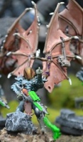
| Username: Sky Serpent User ID: u1 Army Title: Duke Sliscus And The Sky Serpents HQ Entry: The Dark Artiste (Haemonculus, name also WIP  )  This is the Haemonculus that I am currently working on, he comprises of parts from Urien, the generic Haemi, Talos kit, Flagellants and an Archon's soul trap. The idea of the Artiste is he acts as Duke's head beautician and practicing artist, always on the lookout for 'subjects' for his next masterpiece. He will not be far from the Duke in the time of war and realspace raids as he curates his own impromptu exhibitions on the battlefield. To suggest his artistic nature, he has three portraits on show, carried by the tendrils and limbs on his back. My original idea for these was to simply paint portraits on them with possible real life nods but that will be saved for another project in the army; instead I find him using his Shattershard to trap his subjects inside paintings or maybe something even more complex would be a lot more satisfying. CRITQUEMy comments are not meant to be taken as derisive or dismissive. I am posting my thoughts as judge on each submission so each of you will know what I see, what I think about it and how to improve. My goal is to help all of us be proud of what we have accomplished and how to get even better. I know one of the best things I could get when I was competing for my Demons was the judges and fellow competitors critique. I wish to share those lessons I picked up with you guys.This is a really great looking conversion and I am sad that a final model was not submitted. I think it has a great feel to it, rather sinister. The look is like it is watching its plans come to fruition or like a spider who has caught a fly in its web. This model does qualify to be resubmitted for the next HQ edition in the future whenever that may be.
Last edited by Sky Serpent on Mon Dec 12 2011, 23:04; edited 1 time in total | |
| | | | Marquis Vaulkhere
Kabalite Warrior
Posts : 207
Join date : 2011-11-01
Location : Commorragh
| | Subject: Re: The Archon's Challenge Stage 1 HQ edition Mon Dec 12 2011, 00:27 | |
| Username: Marquis Vaulkhere
User ID: u670
Army Title: Lords of the Iron Thorn
HQ entry: Archon Marquis Vaulkhere ~ Lords of the Iron Thorn.
The current wearer of the Ironthorn Crown is the dangerously crazed Marquis Vaulkhere, a towering and bombastic lotus-fiend who spends only a few minutes every cycle in his right mind. Marquis practically bleeds an aura of faded grandeur, but woe betide any who criticise his leadership, for under his velvet façade of sophistication lurks an unholy terror just waiting for an excuse to maim and kill.

And here is the finished Archon. As he is my first DE model to be painted I am not 100% happy with the end result and intend to replace him once I have perfected my DE painting skills.

+Updated++Complete+
CRITIQUE
My comments are not meant to be taken as derisive or dismissive. I am posting my thoughts as judge on each submission so each of you will know what I see, what I think about it and how to improve. My goal is to help all of us be proud of what we have accomplished and how to get even better. I know one of the best things I could get when I was competing for my Demons was the judges and fellow competitors critique. I wish to share those lessons I picked up with you guys.
The conversion on this is simply amazing. I am not sure that is as dark or sinister as something more typical of the fluff, but the face mask makes it appear quite indifferent, which is in of itself fitting the fluff of the Dark Eldar. The dynamics are very good and it has a proper flow of lines of action so nothing seems really out of place.
The final painting on this is hit or miss. Some parts, such as the arms, are quite good, but other areas, like the robes or face mask look like they started off well, but time was not your friend. The flames or wind the figure is standing on looks incomplete as well. So while I get the impression this is not finished, I see the tremendous potential still in this and I feel this will surely be a stunning model that will draw many adoring fans.
Last edited by Marquis Vaulkhere on Tue Jan 24 2012, 01:03; edited 5 times in total | |
| | | | Local_Ork
Fleshsculptor
Posts : 1500
Join date : 2011-05-26
Location : Near good fight!
| | Subject: Re: The Archon's Challenge Stage 1 HQ edition Mon Dec 12 2011, 05:47 | |
| Username: Local_Ork
User ID: u92
Army Title: "Coven of Dyschromia", don't ask why.
HQ entry: Flamer Haemounculus (not sure about wargear yet. Maybe more, maybe less. For sure it would be Haemonculus...)
Last edited by Local_Ork on Tue Dec 13 2011, 13:24; edited 1 time in total | |
| | | | Gobsmakked
Rumour Scourge
Posts : 3274
Join date : 2011-05-14
Location : Vancouver, BC
| | Subject: Re: The Archon's Challenge Stage 1 HQ edition Mon Dec 12 2011, 06:37 | |
| Username: Gobsmakked
User ID: u9
Army Title: The Serpents' Breath Corsairs
HQ entry: Baroness Sathonyx.
WIP pic: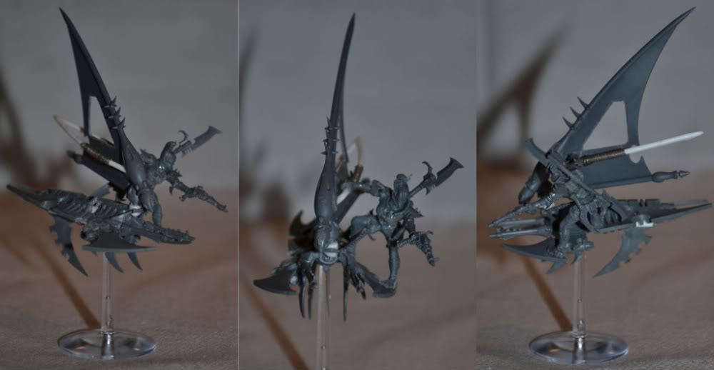 Comment thread is linked here. Comment thread is linked here.I am kidding myself that I will get a new conversion for Vect made and painted for this comp, so I am going to finally finish my Baroness instead. Incredibly, this was one of the very first DE conversions I did with the new range basically a year ago, and I still haven't painted it.  Finished pics: Finished pics:   CRITIQUE CRITIQUE
My comments are not meant to be taken as derisive or dismissive. I am posting my thoughts as judge on each submission so each of you will know what I see, what I think about it and how to improve. My goal is to help all of us be proud of what we have accomplished and how to get even better. I know one of the best things I could get when I was competing for my Demons was the judges and fellow competitors critique. I wish to share those lessons I picked up with you guys.
The conversion work is very well done, and I applaud the highly creative skyboard/catamaran. its a great idea and could be used for a number of other options in a DE army such as venoms.
The paint on the final product is pretty good as well. The darker muted colors are a good choice and overall the scheme is well done. However, what I find distracting, is that the base draws more attention to the eye than the model does. What I see here as the biggest drawback to the model, overall, is that there needs to be a brighter accent on the model to draw they eye from the base to the model. I can see where the brighter blue was used, and the green, and it may be the pictures that do not reflect what is there in real life. But if you look closely, the yellow grass really contrasts with the blue-grey scheme, and is a complement to the green and blue. That is why the base draws attention more so than the model itself.
It really boils down to use of color in the right amounts, which is really a challenge to get a good feel for. Like I said, I think the colors are well done, but there needs to be a little something extra on the model to keep the eye focused on the model and not the base.
What I think could be done to this, without having to redo it, and would give the eye pop to really make this stand out are some yellow orange details or zig zags on the model that would tie the model all together. Something similar or slightly brighter than the grass would pull the attention back on to an already very nice model.
I used to hate when I got told this kind of stuff, but it really helped me to think my models through a little more and it made a lot of difference later on.
I think this is a great entry and will wow anyone who is fortunate, or unfortunate if you are on the other side of the table, to see it in person. It certainly is an HQ to be proud of.
Last edited by Gobsmakked on Mon Jan 23 2012, 07:57; edited 6 times in total | |
| | | | Siticus the Ancient
Wych
Posts : 936
Join date : 2011-09-10
Location : Riga, Latvia
| | Subject: Re: The Archon's Challenge Stage 1 HQ edition Mon Dec 12 2011, 13:58 | |
| Username: Siticus the Ancient User ID: u494 Army title: The Wailing Doom Corsairs HQ entry: Dread Archon Talari Twinblade WIP:  Finished: 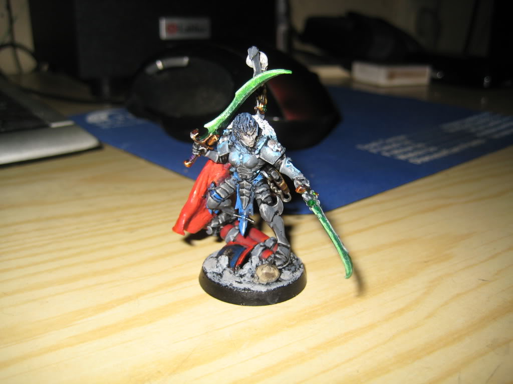 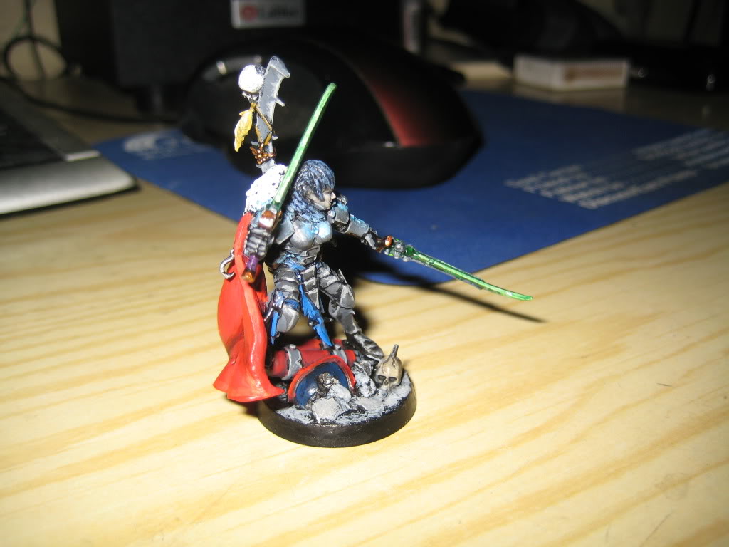  CRITIQUE CRITIQUE
My comments are not meant to be taken as derisive or dismissive. I am posting my thoughts as judge on each submission so each of you will know what I see, what I think about it and how to improve. My goal is to help all of us be proud of what we have accomplished and how to get even better. I know one of the best things I could get when I was competing for my Demons was the judges and fellow competitors critique. I wish to share those lessons I picked up with you guys.
So my initial thoughts is the conversion very well done. I had initially thought the head was one of the Wood elf heads, so props to you for fooling me on the conversion! Great job there. The shoulder pads are not DE pads as best I can tell, so they look just a little off with the rest of the model. Its not a bad thing, just an observation. Maybe a little filing or trimming would help them seem more in line with the model range, but that is just a very minor thing,
The painting is pretty good. I see some off source lighting on the gem in the chest and that looks pretty good. I'm not super sure about the OSL on the shoulder pads, I'm not 100% that is OLS or highlighting.
2 things come to mind on the figure.
1) the figure needs some stronger highlighting or shading, and I am thinking shading. With a grey armor color, its a neutral color and it really needs help to "pop" I see that black has been used to line shade, but might have run a mix of badab black and Asuryan blue to darken the figure a little more, then comeback with the base color and highlights.
2) there are too many colors. I try to keep to a maximum of 3 colors on all my figures. On this figure I see, as major colors that are competing for attention, Grey, Red, Blue, Green and White. One thing that helps is to use neutral colors so the main color you want to stand out does. Its a little challenging to pick up, but once you begin to understand color selection and using your palette, your figures will start looking much much better, from a color standpoint.
To go into a little more detail, the red and the blue really draw the viewers attention away from the body of the model. But since the green contrasts with the red, my eye tends to wander all over the model instead of the fine sculpt work on the face and head. and so as a viewer, I look at the cape, then at the loincloth and then the swords, then white fur cape and then down to the fuel tanks and the cape again and so on. I hope this makes sense to you.
That being said, the base work is good and I like how it was built up to fit the figure in a good dynamic pose. The color on the cape is very vibrant and I like how the highlight colors are more pronounced near the top of the cape and not so much near the bottom. I get the feeling you were trying some Zenithal lighting and would say you are off to a good start.
Overall, this is a well done figure and makes a great archon/focal point and it will certainly draw attention on the table top!
f.
Last edited by Siticus the Ancient on Thu Jan 05 2012, 16:22; edited 3 times in total | |
| | | | Dez
Kabalite Warrior

Posts : 168
Join date : 2011-10-07
| | Subject: Re: The Archon's Challenge Stage 1 HQ edition Mon Dec 12 2011, 14:35 | |
| Username: Dez User ID: u597 Army Title: The Corsairs of the Scarlet Fiend HQ Entry: Baron Sarthonyx Comment Thread: https://thedarkcity.forummotion.com/t1939-hq-edition-comment-thread-dez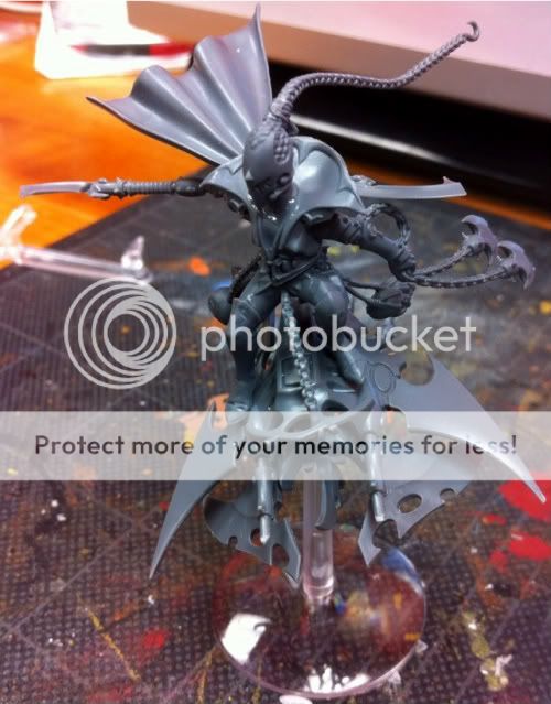 Modified 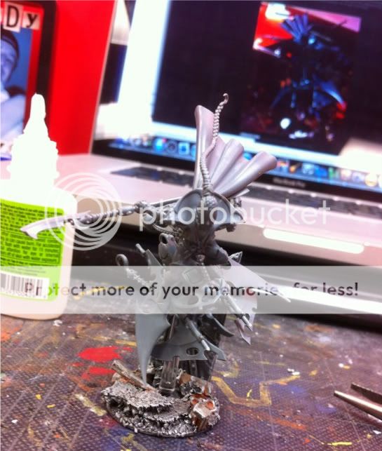 And PIP. 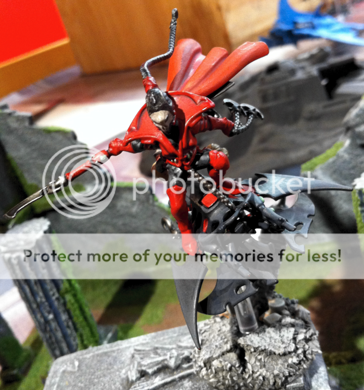 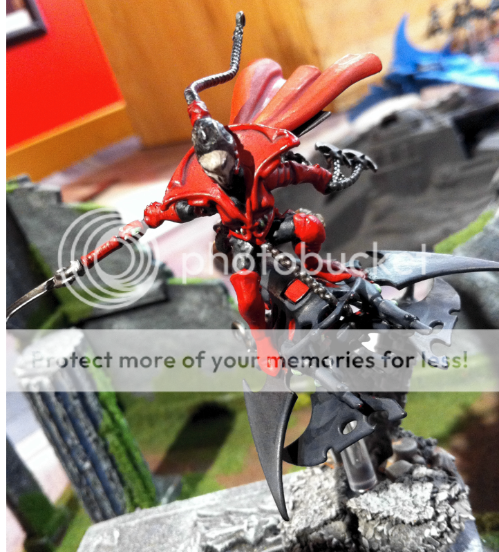 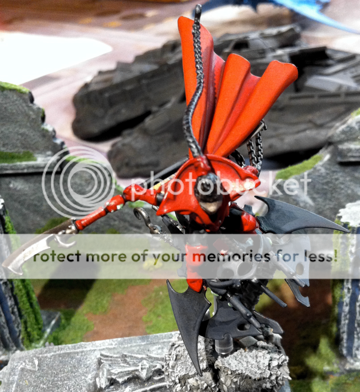 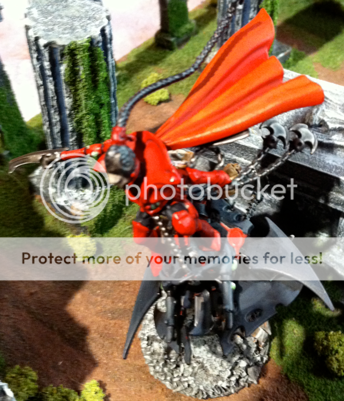 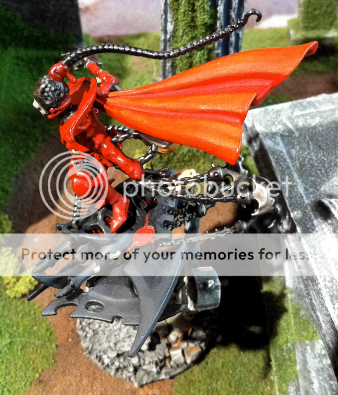 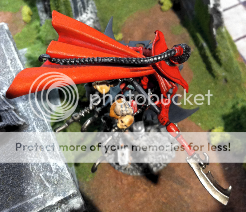 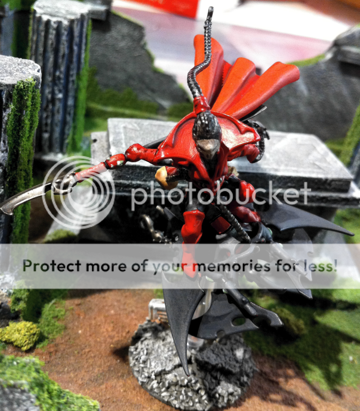 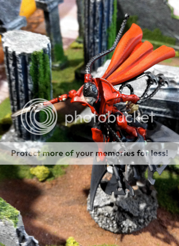 CRITIQUE CRITIQUE
My comments are not meant to be taken as derisive or dismissive. I am posting my thoughts as judge on each submission so each of you will know what I see, what I think about it and how to improve. My goal is to help all of us be proud of what we have accomplished and how to get even better. I know one of the best things I could get when I was competing for my Demons was the judges and fellow competitors critique. I wish to share those lessons I picked up with you guys.
Holy Green Goblin Batman, this figure has a lot going for it!
Dark moody base - check.,
Bright vivid color to contrast with dark moody base - check
Dynamics Jackie Chan would love - check
The dynamics of this are really very good, and I like the flow of it, even the cape is in a agreement with the overall direction of the model.
Painting, it is very bright with the red, and the black skyboard is quite dark, which makes the rider stand out more than it probably should. My thoughts, the skyboard I think is not highlighted enough. I feel another highlight level on the very tips of all the pointy bits on the skyboard would have been really benificial.
Conversely, the rider would benefit from a bit more shading. One thing I like to do with my reds is shade with a bit of blue, which is a cool color, and then keep going with the red the way you have it. the blue will naturally make the red stand out a bit more with out it being quite so intense. The blue is also not a huge wash over the entire model, you apply it in the darkest deepest recesses. I would not use black, since the eye perceives black differently from blue.
One thing that is hard for me to see is the facemask. I see you did some conversion work on it, but I don't have a good view of it.
I had thought about offering that some details on the skyboard to complement the red, but the more I thought about it, I think the black and red contrast is what you were going for and that is really does work for the model as a whole.
It may just be the pictures, but it looks like the hell glaive has a bit muted look. I like this a lot. I often feel we goo a little to over the top on bright weapons, give a dull well used one anyday.
I highly approve of the cork on the flight stand. Cork has got to be one of the best kept secrets in the hobby today.
Good stuff there. Very nice centerpiece you have here.
.
Last edited by Dez on Tue Jan 24 2012, 08:03; edited 4 times in total | |
| | | | Crazy_Irish
Sybarite

Posts : 494
Join date : 2011-05-28
Location : Huntsville, Al
| | Subject: Re: The Archon's Challenge Stage 1 HQ edition Mon Dec 12 2011, 18:11 | |
| Username: crazy_irish User ID: u103 Army Title: The Coven of the Grim Faced HQ Entry: Haemonculus Ancient    CRITIQUE CRITIQUE
My comments are not meant to be taken as derisive or dismissive. I am posting my thoughts as judge on each submission so each of you will know what I see, what I think about it and how to improve. My goal is to help all of us be proud of what we have accomplished and how to get even better. I know one of the best things I could get when I was competing for my Demons was the judges and fellow competitors critique. I wish to share those lessons I picked up with you guys.
I recall seeing the WIP for this figure and it was quite good. The conversion work is well done and it is hard to tell where the transitions are, which is what we want when doing conversion work.
The painting is well done and I don't see any major blemishes. I do see several different layers of color on the cloak which helps break up a plain flesh color.
The skin appears to be slick or wet, which adds a real creepy feel to the figure. I would however, like to see stronger highlighting on the skin and the green skirt he has on. Those would really add to the intensity of the figure and are just a bit too subtle to make this one stand out like I feel it can. I totally get this, since I struggle myself with subtle and more often than not I have to go back and increase my highlights to make the figure look the its supposed to look as I envisioned it.
The thing that really helps this figure out, to me is the background on the base. The arch is a very nice touch and it really helps the figure have some menace, which is hard for a static figure. I would add, however, I feel that the arch needs some more interest, such as some wear and tear or a battle damage, as well as stronger highlighting.
I feel that with those suggestions, this figure would go from amazing to stunning. This is a great looking model!
Last edited by Crazy_Irish on Fri Jan 06 2012, 23:55; edited 4 times in total | |
| | | | POwell0
Kabalite Warrior

Posts : 101
Join date : 2011-10-25
Location : Cheshire, UK
| | Subject: Re: The Archon's Challenge Stage 1 HQ edition Mon Dec 12 2011, 20:58 | |
| Username: POwell0 User ID: u637 Army Title: Kabal of the Broken One and Cult of the Withered Mistress HQ Entry: Succubus - Heldana Linvail the Withered Mistress herself!! My WIP pics:   Finished pics:  CRITIQUE CRITIQUE
My comments are not meant to be taken as derisive or dismissive. I am posting my thoughts as judge on each submission so each of you will know what I see, what I think about it and how to improve. My goal is to help all of us be proud of what we have accomplished and how to get even better. I know one of the best things I could get when I was competing for my Demons was the judges and fellow competitors critique. I wish to share those lessons I picked up with you guys.
This model has a lot of dynamics going on. I like the added bits included into this such as the spear and blade on the pistol. Those are great additions to dress this figure up. I almost feel like the pose is a little off, almost like she is leaning back a bit to much, but really it could be any number of things. It just feels a little off. Not a big deal.
The painting, while it is not what we would call Golden Demon Quality, it is very neat and clean. I say this because it is important to note that not every model has to be museum quality in terms of its technical difficulty. A blended model that is sloppy is still sloppy, and this figure is meticulously clean and neat which from a painters perspective is very important.
The colors used are also well thought out. Purple body suit with the red-orange hair makes a nice contrast and the gold goes well with the red-orange. Not too busy or complicated.
This is a well done figure which was well thought out and will look great on the table.
.
Last edited by POwell0 on Fri Jan 13 2012, 16:16; edited 1 time in total | |
| | | | gunnerboy1607
Kabalite Warrior

Posts : 149
Join date : 2011-11-12
| | Subject: Re: The Archon's Challenge Stage 1 HQ edition Tue Dec 13 2011, 03:44 | |
| Username: gunnerboy1607 User ID: u707 Army Title: Corsairs of the Shivering Isles HQ Entry: The feared Archon Fusro Caranath WIP photo:  Finished product:   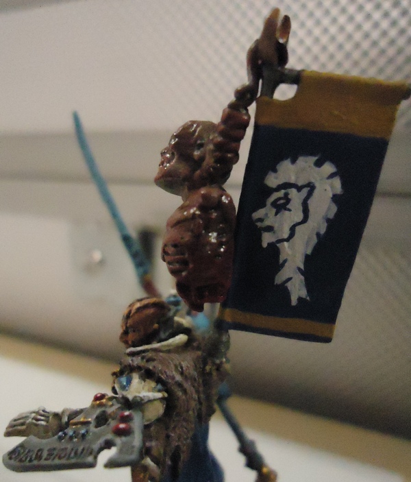  !!! CRITIQUE
My comments are not meant to be taken as derisive or dismissive. I am posting my thoughts as judge on each submission so each of you will know what I see, what I think about it and how to improve. My goal is to help all of us be proud of what we have accomplished and how to get even better. I know one of the best things I could get when I was competing for my Demons was the judges and fellow competitors critique. I wish to share those lessons I picked up with you guys.
The conversion on this model is first rate. The pose is good, and what a great idea it was to use CW Eldar bits to add soe interest to the figure.
The painting is interesting. What I mean by this is some parts are well done, others seem untidy. The armor has the most attention to detail, but areas like the cloak on his back seem not as neat, which is unfortunate from an otherwise brilliant figure.
The color selection is good, it has a goof feel to it. And while there are lots of different colors, they are small and bunched together so they do not compete for the eyes attention. Very well done.
The banner is a nice touch. I like the banner, its simple, effective, and make you wonder if this is CWE or DE. All the better to get up and close and personal with.
I like this figure very much. It is well thought out, executed cleanly for the most part, and is in a striking color scheme that will certainly draw attention.
.
Last edited by GAR on Wed Feb 08 2012, 17:29; edited 2 times in total (Reason for editing : Posting the finished photos.) | |
| | | | Tanhausen
Hellion
Posts : 75
Join date : 2011-11-17
Location : Spain
| | Subject: Re: The Archon's Challenge Stage 1 HQ edition Tue Dec 13 2011, 12:02 | |
| Username: Tanhausen
Used ID: u721
Army Title: Soul Harvesters
HQ Entry: Beauty Surgeon (Haemunculi) | |
| | | | Massaen
Klaivex

Posts : 2268
Join date : 2011-07-05
Location : Western Australia
| | Subject: Re: The Archon's Challenge Stage 1 HQ edition Tue Dec 13 2011, 12:38 | |
| Username: Massaen Used ID: u308 Army Title: Kabal of Shattered Thorns HQ Entry: Drazhar  Edit 18 Dec... and the finished model      CRITIQUE CRITIQUE
My comments are not meant to be taken as derisive or dismissive. I am posting my thoughts as judge on each submission so each of you will know what I see, what I think about it and how to improve. My goal is to help all of us be proud of what we have accomplished and how to get even better. I know one of the best things I could get when I was competing for my Demons was the judges and fellow competitors critique. I wish to share those lessons I picked up with you guys.
I like this conversion. The figure is very dynamic, has a lot of visual interest and the conversion neat and clean.
Painting, it is another simple paint scheme. Black and white, no shade or highlight on the armor that I can see in t the pictures. But I feel I need to comment that it is very neat and clean, and the color selection is well doe as well.I am not sure how much technical skill the painter has, or maybe in working with black and white, BUT and its a big butt, he has painted a very precise figure with great attention and it is very impressive. Give me a great looking, but simply executed model any day over a more technically difficult but cluttered looking model any day. An entire army painted like this would be amazing to see, its so clean that the neatness speak for itself.
An excellent figure, and one to be proud of. I am very fond of this style of painting and it always impresses me when I see it well done.
Last edited by Massaen on Sun Dec 18 2011, 08:41; edited 1 time in total | |
| | | | Cailos
Kabalite Warrior
Posts : 208
Join date : 2011-09-08
Location : Texas
| | Subject: Re: The Archon's Challenge Stage 1 HQ edition Tue Dec 13 2011, 19:46 | |
| Username: Cailos
Used ID: u488
Army Title: Kabal of the Void Sky
HQ Entry: Archon Seliniana Sercot
I am going to have to say I will not be able to do this one. I can't find the mini anymore. This is why you shouldn't let your wife clean you warhammer stuff up without you around because you lose stuff. It was my fault really I should put it somewhere other than on top of the TV.
Last edited by Cailos on Wed Jan 04 2012, 20:53; edited 1 time in total | |
| | | | Dogmar
Sybarite
Posts : 397
Join date : 2011-11-22
Location : Germany
| | Subject: Re: The Archon's Challenge Stage 1 HQ edition Tue Dec 13 2011, 22:03 | |
| Username: Dogmar User ID: u733 Army Title: Kabal of the Frozen Sun (WIP name) HQ Entry: Haemonculus Ath'anyr, the Adept WIP:   Finished: 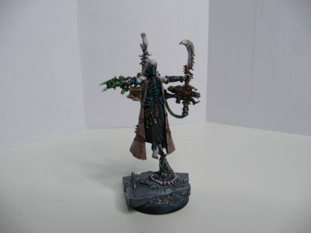 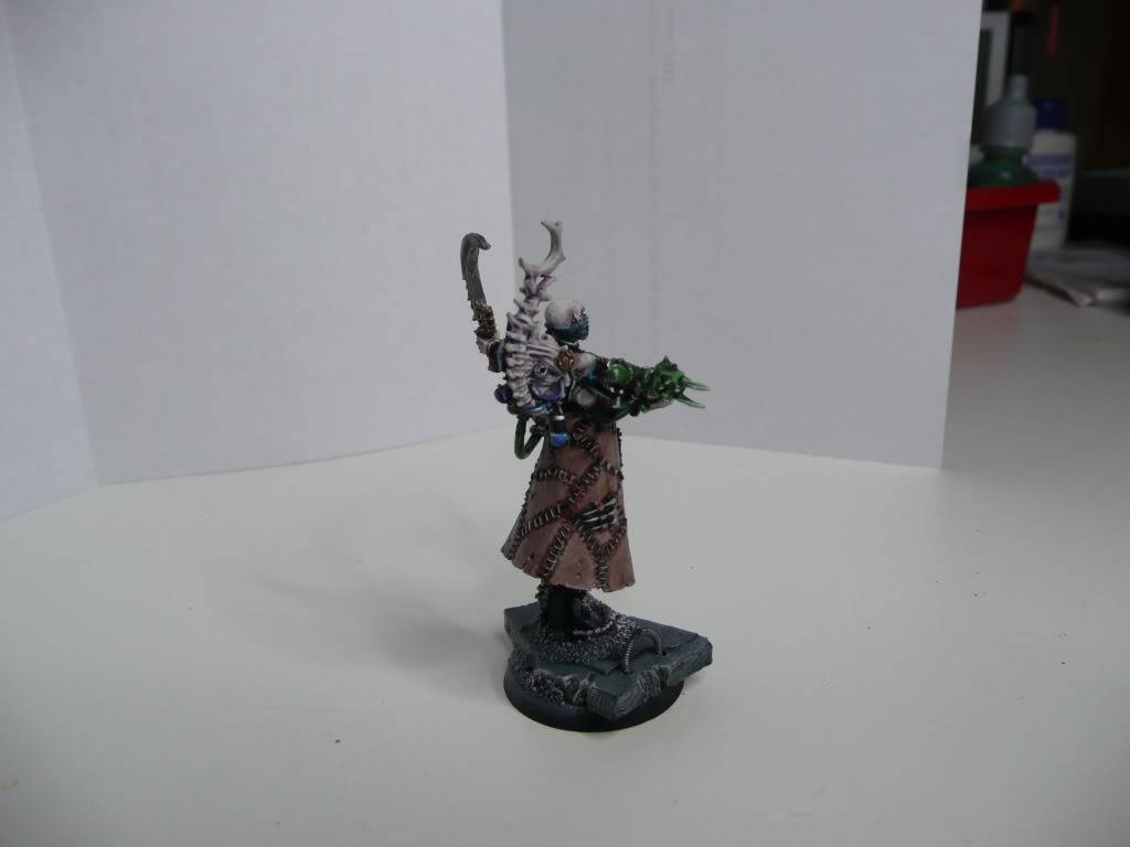  The right hand is different because I broke the original one in the painting process - damn failcast. More pictures on demand after the voting. CRITIQUE
My comments are not meant to be taken as derisive or dismissive. I am posting my thoughts as judge on each submission so each of you will know what I see, what I think about it and how to improve. My goal is to help all of us be proud of what we have accomplished and how to get even better. I know one of the best things I could get when I was competing for my Demons was the judges and fellow competitors critique. I wish to share those lessons I picked up with you guys.
The model is a straight up out of the box haemii. it is well put together, I don't see any gaps or mold lines.
Painting. The paint scheme is excellent. I think the cloak is dry brushed, but it looks like a lot of time was taken to prevent a grainy feel from appearing on it. The colors are great, the shade and highlight is neatly done and is subtle, which is something I like. Also, I love that the metallics were shaded. Major brownie points with me, since so often, they are just painted on and left as bare metal.
Very nice. Very nice indeed.
.
Last edited by Dogmar on Thu Jan 19 2012, 21:58; edited 2 times in total | |
| | | | Archeonlotet
Kabalite Warrior
Posts : 190
Join date : 2011-11-10
Location : Flab Quarv 6
| | Subject: Re: The Archon's Challenge Stage 1 HQ edition Wed Dec 14 2011, 04:34 | |
| Username: Archeonlotet UserID: u703 Army Title: Marauders of the Bleak Moon (WIP) HQ Entry: Baroness Sathonyx  Finished Product - I hope you guys enjoy it    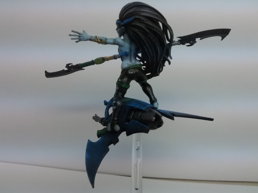 CRITIQUE CRITIQUE
My comments are not meant to be taken as derisive or dismissive. I am posting my thoughts as judge on each submission so each of you will know what I see, what I think about it and how to improve. My goal is to help all of us be proud of what we have accomplished and how to get even better. I know one of the best things I could get when I was competing for my Demons was the judges and fellow competitors critique. I wish to share those lessons I picked up with you guys.
I like the use of the Dark Elf Sorceresss bits. its a nice conversion.
The painting is pretty good, I can see the dry brush highlights on the hair and sky board, but then I see layering on the body of the baroness, and it looks a little off.
Overall the figure has a cool feel, what I think would give it more vibrance is to use a normal warmer fleshtone. I know the GW art has DE as darker more grey, and thats fine. There is nothing wrong with the skin tone. My only point, from a painter perspective, is that a warm tone would stand out more than a cooler one. But if it clashes with the army as a whole, then not so much. Its a relatively minor knitpick, and is mostly a matter of preference and not a problem per se with the figure as a whole.
I like the metallics on the pants. Its an interesting feature to the model.
Last edited by Archeonlotet on Tue Jan 10 2012, 01:03; edited 1 time in total | |
| | | | nalfen
Hellion

Posts : 53
Join date : 2011-08-29
Location : Montreal
| | Subject: Re: The Archon's Challenge Stage 1 HQ edition Wed Dec 14 2011, 16:45 | |
| Username: Nalfen UserID: u462 Army Title: Cult of the Sweet Oblivion HQ Entry: Baron Sathonyx  | |
| | | | Angrypeasant
Hellion
Posts : 47
Join date : 2011-11-14
| | Subject: Re: The Archon's Challenge Stage 1 HQ edition Wed Dec 14 2011, 17:14 | |
| Name: angrypeasant User ID : u711 Army Name: <insert name here> HQ Name: GW Succubus  Its coming to my house in my stocking... minor conversion, perhaps a weapon swap
Last edited by Angrypeasant on Wed Dec 28 2011, 06:17; edited 1 time in total | |
| | | | speedfreek
Sybarite

Posts : 373
Join date : 2011-05-18
Location : Sweden
| | Subject: Re: The Archon's Challenge Stage 1 HQ edition Thu Dec 15 2011, 09:46 | |
| Name: speedfreek User ID : u46 Army Name: Harlequinade Macabre HQ Name: Haemonculi A first rough WIP. Will post a finished model before paintingwhen I get that far.  some progress later... 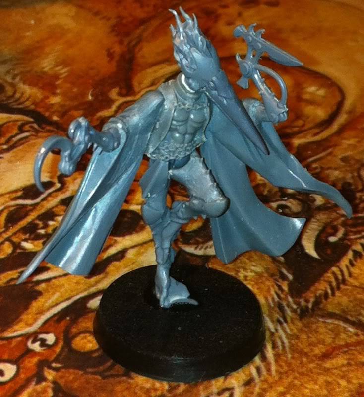 And just before painting  And finally done!   
Last edited by speedfreek on Sat Jan 21 2012, 08:34; edited 4 times in total | |
| | | | Preacher
Kabalite Warrior
Posts : 145
Join date : 2011-05-24
Location : Derby, UK
| | Subject: Re: The Archon's Challenge Stage 1 HQ edition Thu Dec 15 2011, 10:40 | |
| Name: Preacher User ID : u83 Army Name: Sundered Venom Warband, Kabal of the Poisoned Claw HQ Name: Soldaan Kerunat WIP Picture:   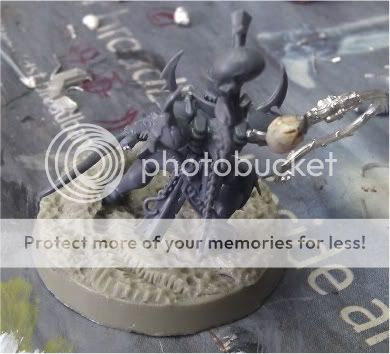 Edit: Completed (for the time being) Pictures: 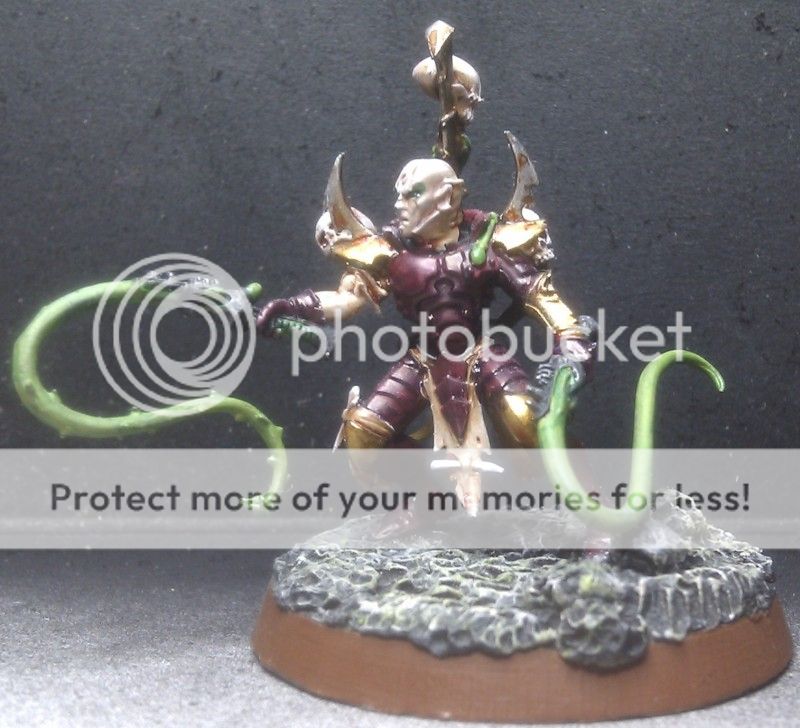 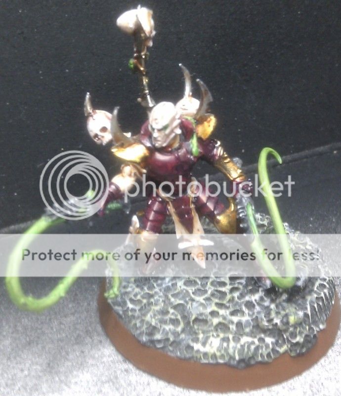 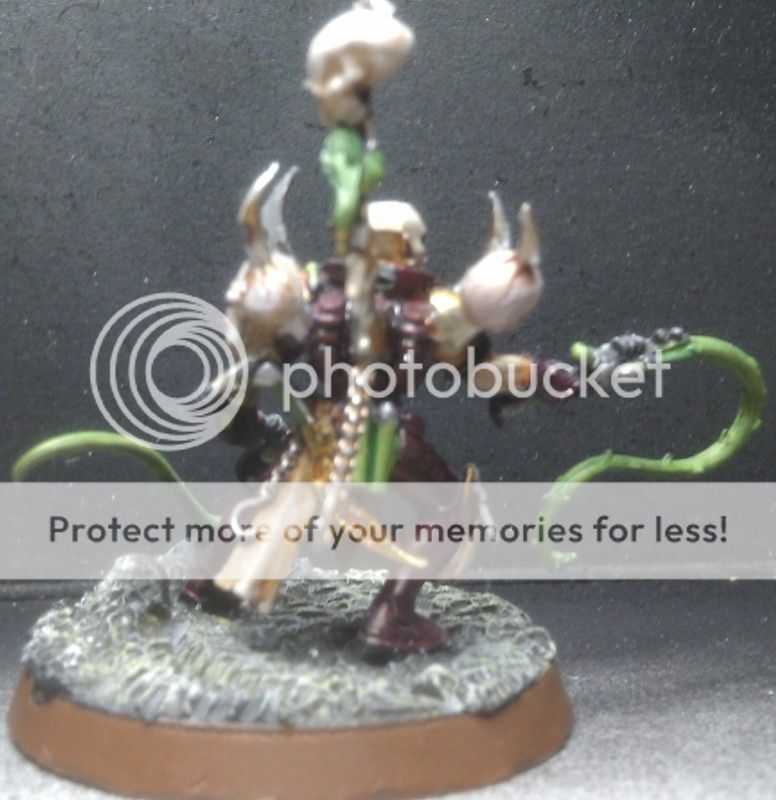
Last edited by Preacher on Thu Jan 12 2012, 22:33; edited 1 time in total | |
| | | | Saintspirit
Court of Cruelty
Posts : 1002
Join date : 2011-05-19
Location : Sweden
| | Subject: Re: The Archon's Challenge Stage 1 HQ edition Thu Dec 15 2011, 17:08 | |
| Name: Saintspirit User ID : u65 Army Name: Kabal of the Shadow Phoenix HQ Name: The Dusk Knight, Hierarch of the Dark Temple (Counts as Drazhar) WIP Picture: 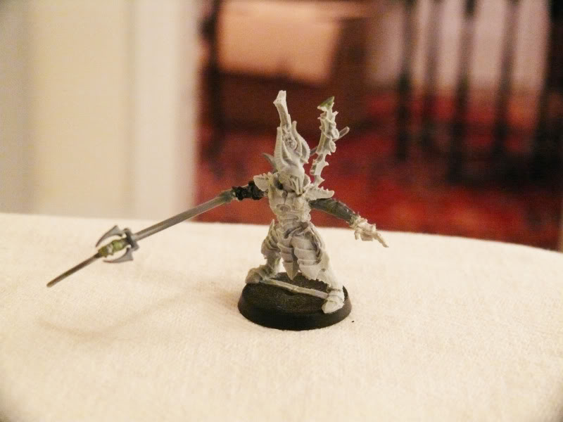  Finished Picture: 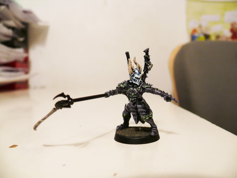 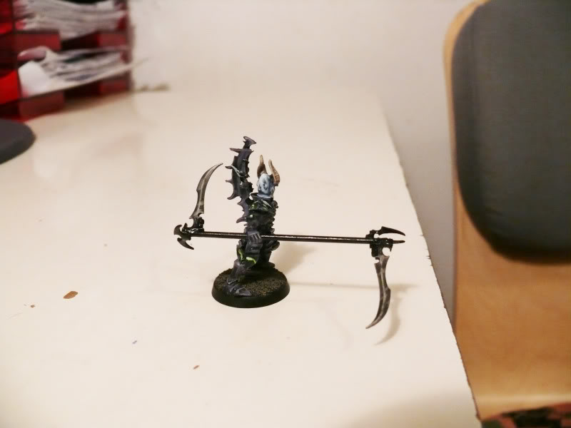
Last edited by Saintspirit on Sun Jan 22 2012, 20:08; edited 1 time in total | |
| | | | asmodai650
Slave
Posts : 9
Join date : 2011-06-29
Location : Chapel Hill, TN
| | Subject: Re: The Archon's Challenge Stage 1 HQ edition Mon Dec 19 2011, 22:41 | |
| Username: Asmodai650
User ID: u294
Army Title: undecided....
HQ Entry: Lilith Hesperax (as soon as christmas comes!) | |
| | | | wilku
Archon's Challenge HQ Winner

Posts : 100
Join date : 2011-12-19
Location : Poland
| | Subject: Re: The Archon's Challenge Stage 1 HQ edition Tue Dec 20 2011, 13:53 | |
| Username: wilku User ID: u819 Army Title: yet to be named HQ Entry: Lhamaean (thanks for approving it) Stage 1: https://i.servimg.com/u/f42/17/12/16/04/stage_10.jpg (I finally understand what finecast is for - increasing GS sales  ) Stage 2: Finished face, shading of the dres in progress. She'll be an ice queen for sure https://i.servimg.com/u/f42/17/12/16/04/lhamae10.jpg (GS still to do and generally speaking the cast sucks :/ ) Stage 3: Almost finished - still to do: poison on the sword, the bone in her hair... (GS), some final touch-ups & a base https://i.servimg.com/u/f42/17/12/16/04/stage_11.jpg FINISHED (three shots, to see better. I'm kind of... proud of it )   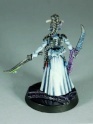
Last edited by wilku on Sat Jan 14 2012, 23:14; edited 6 times in total | |
| | | | Evil Space Elves
Haemonculus Ancient

Posts : 3717
Join date : 2011-07-13
Location : Santa Cruz, ca
| | Subject: Re: The Archon's Challenge Stage 1 HQ edition Wed Dec 21 2011, 05:27 | |
| Username: Evil Space Elves Usedr ID: u327 Army Title: The Baron's Flying Circus HQ Entry: Baron Sathonyx (EDIT) Really should have read the rules better. I thought that the entry was due December 21st, not January 21st. Scratch that Archon; I can easily get this Baron conversion(heavily stealing from Dez!) done by then! (Just to add yet ANOTHER Baron to this contest!  ) Very WIP: 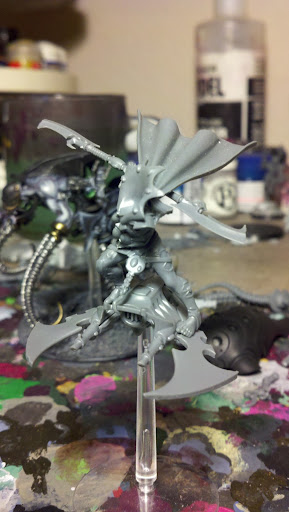  I think that I will try to do only entries that fly or don't touch the ground for the Archon's Challenge. Should be fun!  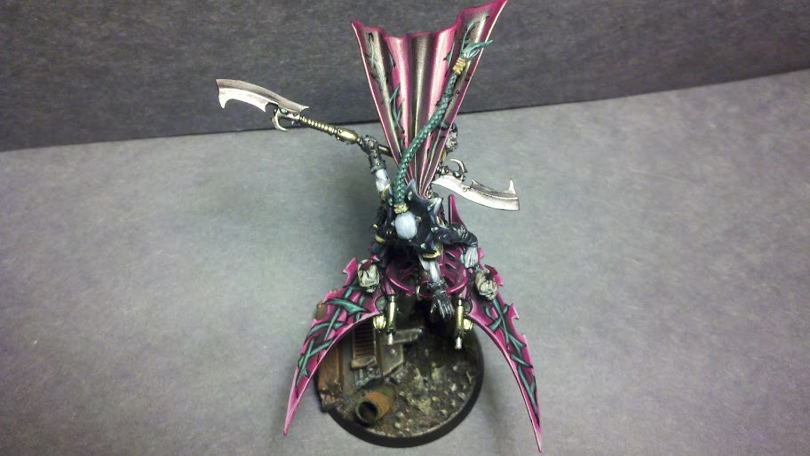 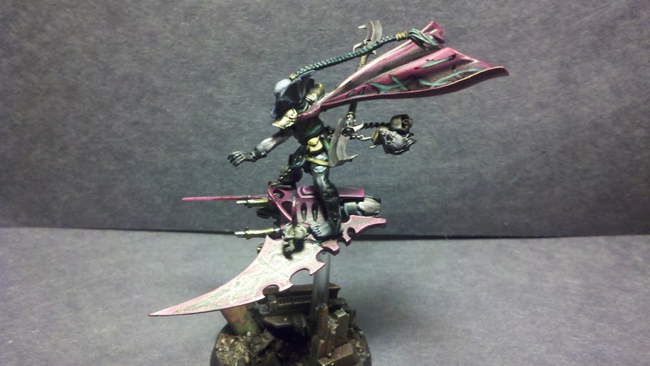 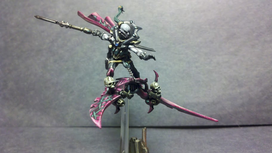
Last edited by Evil Space Elves on Sun Jan 22 2012, 08:56; edited 3 times in total | |
| | | | Archon_Hellsbuttmonkey
Slave
Posts : 11
Join date : 2011-12-20
| | Subject: Re: The Archon's Challenge Stage 1 HQ edition Wed Dec 21 2011, 07:48 | |
| Name: Archon_Hellsbuttmonkey User ID : u824 Army Name: The Kabal of the Shattered Wind HQ Name: Malekor the Infernal I have had the old Urien Rakarth model knocking around my collection unpainted for about 12 years and when I restarted 40k I thought it was a good opportunity to have a different model for my Ancient. WIP Picture:  UPDATE:  started work on his skin first, trying to go for a scalded, peeling look to it. UPDATE 2:  THE FINAL MODEL 
Last edited by Archon_Hellsbuttmonkey on Sun Jan 22 2012, 11:31; edited 3 times in total | |
| | | | DarkKokabel
Hellion

Posts : 62
Join date : 2011-07-24
Location : Texas, USA
| | Subject: Re: The Archon's Challenge Stage 1 HQ edition Thu Dec 22 2011, 06:04 | |
| Username: DarkKokabel User ID: u356 Army Title: The Corsairs of the Clockwork Angels HQ Entry: Asdrubael Vect (in a very bright and steampunk fashion) WIP:   Finished product will be up just before due. Working on a model for a painting contest/40k event at my local GW. Sorry about the couple of extra colors, as you can see though it's still mostly not done or anywhere close and thanks for approval. | |
| | | | Sponsored content
| | Subject: Re: The Archon's Challenge Stage 1 HQ edition | |
| |
| | | | | | The Archon's Challenge Stage 1 HQ edition | |
|
Similar topics |  |
|
| | Permissions in this forum: | You cannot reply to topics in this forum
| |
| |
| |
|


