| | Painting Journal |  |
|
+10greater_fishy The Eye of Error Gobsmakked SebastionSynn Dogmar Sky Serpent Mngwa ravengoescaw mrsquiggle Veritas 14 posters |
| Author | Message |
|---|
Veritas
Hellion

Posts : 36
Join date : 2012-12-04
 |  Subject: Painting Journal Subject: Painting Journal  Tue Apr 09 2013, 18:13 Tue Apr 09 2013, 18:13 | |
| I've been inspired. My Kabal will be fashionistas and dabble in vibrant clothing and hair styles. It's all about what the weekly fashion is, right?  To that end I've started with models that I'll be using at Adepticon in the Combat Patrol tournament, since it's only a few models to paint. Bright satin yellow and black armor, along with glossy black leather pants, gloves, and boots and neon green hair is reminiscent of cybergoths, and I love it (though it is not my own personal fashion  ). Who says Dark Eldar need to be dark on the outside? I'll be adding more to this thread as I paint more, so check back for updates. If a paint scheme breakdown is desired, I'll add it to this first post. Enjoy! 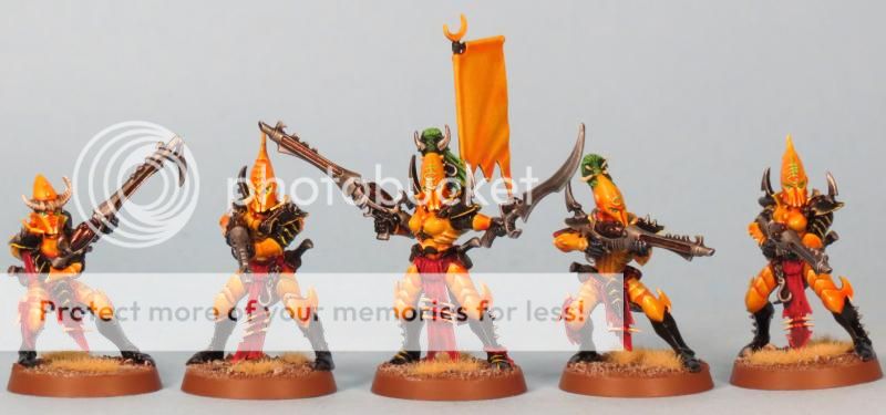 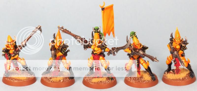 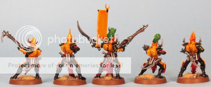   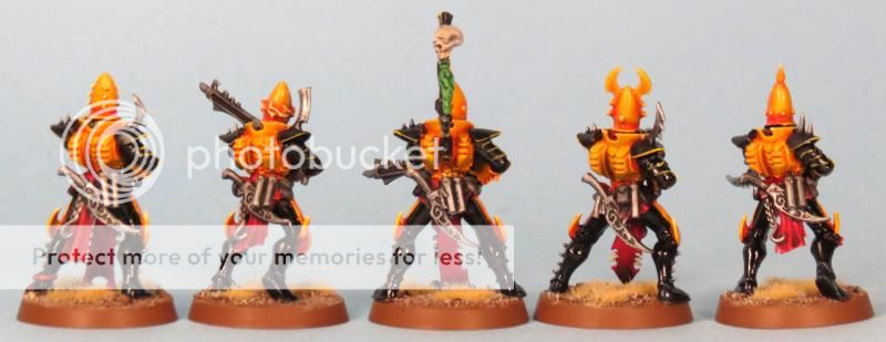 How I did it: How I did it:: 1. Prime white, everything. Yellow:- 2x Casandora Yellow wash - Sunburst Yellow highlights - Dorn Yellow top highlights Black w/grey:- Chaos Black base - Shadow Grey highlights - Codex Grey top highlights Black w/yellow:- Chaos Black base - Iyanden yellow highlights - Sunburst yellow top highlights Red:- Mechrite Red base - Red Gore highlights - Blood Red top highlights - Carroburg Crimson wash Green:- Warboss Green base - Biel-tan Green wash - Warboss Green highlights - Scorpion Green top highlights Gloss Effect:- 'ard Coat Semi-gloss Effect:- Microscale Satin
Last edited by Veritas on Tue Apr 16 2013, 15:53; edited 2 times in total | |
|
  | |
mrsquiggle
Slave

Posts : 15
Join date : 2013-04-05
 |  Subject: Re: Painting Journal Subject: Re: Painting Journal  Wed Apr 10 2013, 00:01 Wed Apr 10 2013, 00:01 | |
| I really like it. Very curious about what the vehicles will look like | |
|
  | |
ravengoescaw
Heamonculi
Posts : 215
Join date : 2012-09-27
Location : Corvallis, OR
 |  Subject: Re: Painting Journal Subject: Re: Painting Journal  Wed Apr 10 2013, 10:10 Wed Apr 10 2013, 10:10 | |
| | |
|
  | |
Mngwa
Wych
Posts : 955
Join date : 2013-01-26
Location : Stadi
 |  Subject: Re: Painting Journal Subject: Re: Painting Journal  Wed Apr 10 2013, 11:20 Wed Apr 10 2013, 11:20 | |
| They are bright, indeed, CW Eldar bright, but they do have that some kind of "darkness" in their colours (boots and shoulderpads!). Really good! | |
|
  | |
Sky Serpent
Adrenalight Junkie

Posts : 2433
Join date : 2011-02-26
Location : Dais Of Administration
 |  Subject: Re: Painting Journal Subject: Re: Painting Journal  Wed Apr 10 2013, 11:26 Wed Apr 10 2013, 11:26 | |
| I love them and am slightly jealous of them which means they are very good  They are very similar to Phil Kelly's Sky Serpent army. I'd like to see a bit more flayed flesh, if you do go with flesh then go with a muted purple tone as this will complement the yellow well. Also how about some purple in the yellow highlights for a natural tone and make some of the features pop more? Go even brighter with the hair  | |
|
  | |
Dogmar
Sybarite
Posts : 397
Join date : 2011-11-22
Location : Germany
 |  Subject: Re: Painting Journal Subject: Re: Painting Journal  Wed Apr 10 2013, 15:11 Wed Apr 10 2013, 15:11 | |
| I love it, really. The brightness is shocking initially and my own army is more of the dark sort, but sometimes I think having them brighter would be better. I'd second Sky's statement about jealousy.
Nice idea and well executed! | |
|
  | |
Veritas
Hellion

Posts : 36
Join date : 2012-12-04
 |  Subject: Re: Painting Journal Subject: Re: Painting Journal  Wed Apr 10 2013, 15:28 Wed Apr 10 2013, 15:28 | |
| - mrsquiggle wrote:
- I really like it. Very curious about what the vehicles will look like
Probably more black than yellow. I'm working on two Venoms and a Razorwing right now (well only one Venom, the other two haven't arrived yet!) and they need to be done by the 20th, so you'll see soon enough! - Mngwa wrote:
- They are bright, indeed, CW Eldar bright, but they do have that some kind of "darkness" in their colours (boots and shoulderpads!). Really good!
Thanks! That's what I was going for, so good thing I found it. - Sky Serpent wrote:
- I love them and am slightly jealous of them which means they are very good

They are very similar to Phil Kelly's Sky Serpent army.
I'd like to see a bit more flayed flesh, if you do go with flesh then go with a muted purple tone as this will complement the yellow well. Also how about some purple in the yellow highlights for a natural tone and make some of the features pop more?
Go even brighter with the hair   His army was the inspiration. I found a way I like painting yellow and I was itching to paint something in it. Didn't want to do Iyanden because I already have Ulthwe, didn't want to do Imperial Fists because I have too many marines, so here I arrived and am quite happy with it. Question though, how would purple highlights make features pop? Wouldn't I want purple shading to do that? I do want to go brighter with the hair. Scorpion green just doesn't have the quality I'm looking for; along with the banner design that I'm still contemplating, I'll mix something up and give 'em another highlight! | |
|
  | |
Veritas
Hellion

Posts : 36
Join date : 2012-12-04
 |  Subject: Re: Painting Journal Subject: Re: Painting Journal  Tue Apr 16 2013, 08:37 Tue Apr 16 2013, 08:37 | |
| | |
|
  | |
mrsquiggle
Slave

Posts : 15
Join date : 2013-04-05
 |  Subject: Re: Painting Journal Subject: Re: Painting Journal  Tue Apr 16 2013, 08:44 Tue Apr 16 2013, 08:44 | |
| Wow jealous. How do you get that glossy black? | |
|
  | |
SebastionSynn
Hellion

Posts : 91
Join date : 2013-04-04
Location : In the darkest corners of your mind.
 |  Subject: Re: Painting Journal Subject: Re: Painting Journal  Tue Apr 16 2013, 11:23 Tue Apr 16 2013, 11:23 | |
| - mrsquiggle wrote:
- Wow jealous. How do you get that glossy black?
i would say he used a Pearl Black, i use Pearl Black in my CWE army and it comes out glossy like that. great job, but i think the vehicles could use a bit more yellow, other than that the whole thing is spot on. | |
|
  | |
Veritas
Hellion

Posts : 36
Join date : 2012-12-04
 |  Subject: Re: Painting Journal Subject: Re: Painting Journal  Tue Apr 16 2013, 15:42 Tue Apr 16 2013, 15:42 | |
| They're meant as contrast to the infantry and have more black than yellow; can't look too craftworldy now!  Since it's requested, paint guides will go into the first post! | |
|
  | |
Gobsmakked
Rumour Scourge
Posts : 3274
Join date : 2011-05-14
Location : Vancouver, BC
 |  Subject: Re: Painting Journal Subject: Re: Painting Journal  Wed Apr 17 2013, 23:11 Wed Apr 17 2013, 23:11 | |
| Beautiful work Veritas! I really like your entire army, but the Razorwing and two Venoms really are standouts.
Looking forward to more.
Cheers! | |
|
  | |
The Eye of Error
Dark Architect
Posts : 552
Join date : 2011-05-24
Location : Aelindrach
 |  Subject: Re: Painting Journal Subject: Re: Painting Journal  Thu Apr 18 2013, 04:49 Thu Apr 18 2013, 04:49 | |
| Greta work, very stunning colors and very clean paint job.
Looks like the glossy black was just plain black with a nice satin varnish over the whole model when done.
I really enjoy semi-glossy finishes like that, they work well under the photo lights and look great on the table. | |
|
  | |
greater_fishy
Slave

Posts : 20
Join date : 2012-11-15
 |  Subject: Re: Painting Journal Subject: Re: Painting Journal  Thu Apr 18 2013, 08:25 Thu Apr 18 2013, 08:25 | |
| Brilliant work! I love what you've done with the vehicles
Inspiration to finish my own perhaps. | |
|
  | |
Tangentical
Hellion
Posts : 96
Join date : 2012-10-19
Location : London
 |  Subject: Re: Painting Journal Subject: Re: Painting Journal  Fri Apr 19 2013, 12:57 Fri Apr 19 2013, 12:57 | |
| Nice, I went for gold as my bright counterfoil to all the dark colours as I wasn't really brave enough to go yellow!
Maybe I'll go this direction with some Corsairs.
This journal would be good in Project Logs too (I usually look there for army inspiration and here for styles, tips etc).
cool beans. | |
|
  | |
SebastionSynn
Hellion

Posts : 91
Join date : 2013-04-04
Location : In the darkest corners of your mind.
 |  Subject: Re: Painting Journal Subject: Re: Painting Journal  Sat Apr 20 2013, 08:08 Sat Apr 20 2013, 08:08 | |
| - Quote :
- 1. Prime white, everything. Yellow: - 2x Casandora Yellow wash - Sunburst Yellow highlights - Dorn Yellow top highlights
I keep coming back to this and looking at that Yellow, and I've decided that i like it but i need to eliminate the red (which i think is the wash) and replace it with Badab Black or Nuln Oil so that it will look proper on my Bad Moonz Orkz. so if you please, verify this, white prime or in my case for Bad Moonz white primer in select spots(which i can do with just a regular layering of white) followed by Sunburst Yellow? and then edge highlight w/ Dorn Yellow?, wash it , and then drybrush with Sunburst again (which would show some areas as dirty and others not as dirty) or would i be better off trying to stipple the sunburst yellow rather than drybrushing. | |
|
  | |
Veritas
Hellion

Posts : 36
Join date : 2012-12-04
 |  Subject: Re: Painting Journal Subject: Re: Painting Journal  Mon Apr 22 2013, 04:56 Mon Apr 22 2013, 04:56 | |
| Hmm, there's no red other than with the loin cloth. Must just be the picture.
You might want to stipple, at any rate. | |
|
  | |
SebastionSynn
Hellion

Posts : 91
Join date : 2013-04-04
Location : In the darkest corners of your mind.
 |  Subject: Re: Painting Journal Subject: Re: Painting Journal  Mon Apr 22 2013, 05:28 Mon Apr 22 2013, 05:28 | |
| - Quote :
 look at the lower section of the helms, it looks like an area of pooled red wash. at any rate, thanks, i'll give it a try once i get settled into wherever it is i'm going to be living next. | |
|
  | |
Cavash
Lord of the Chat

Posts : 3237
Join date : 2012-04-15
Location : Stuck in an air vent spying on plotters
 |  Subject: Re: Painting Journal Subject: Re: Painting Journal  Mon Apr 22 2013, 10:26 Mon Apr 22 2013, 10:26 | |
| I'm feeling very jealous of this paint scheme. It seems that I'll be painting my Craftworlders yellow with your guide! That yellow is beautiful and works so well on your Dark Eldar. Cheers!  | |
|
  | |
Cavash
Lord of the Chat

Posts : 3237
Join date : 2012-04-15
Location : Stuck in an air vent spying on plotters
 |  Subject: Re: Painting Journal Subject: Re: Painting Journal  Mon May 20 2013, 17:11 Mon May 20 2013, 17:11 | |
| Just so you know, I'm liberating the yellow from this guide for my Craftworlders. I've got the money and when they're released I'm yellowing them up!  | |
|
  | |
GAR
Dread Pirate
Posts : 910
Join date : 2011-05-19
 |  Subject: Re: Painting Journal Subject: Re: Painting Journal  Thu May 23 2013, 13:39 Thu May 23 2013, 13:39 | |
| Topic moved to Project logs
AN interesting scheme... I think what bothers me about it is there are too many colors, but that is my personal quirk, so that it with a grain of salt.
The models are very bright and vivid, and the painting is nice and clean. It will be a sure standout on the table.
I have been on a bit of a yellow kick myself for my DE, but my own Black Halo are more golden yellow than bight yellow.
Very nice. | |
|
  | |
Saintspirit
Court of Cruelty
Posts : 1002
Join date : 2011-05-19
Location : Sweden
 |  Subject: Re: Painting Journal Subject: Re: Painting Journal  Thu May 23 2013, 14:02 Thu May 23 2013, 14:02 | |
| I can agree that it is almost a bit too strong of yellow, but I don't think there are too many colours. Na, I like it, it is very well made indeed. Feels a little like corsairs or something, actually. | |
|
  | |
Veritas
Hellion

Posts : 36
Join date : 2012-12-04
 |  Subject: Re: Painting Journal Subject: Re: Painting Journal  Thu May 23 2013, 18:51 Thu May 23 2013, 18:51 | |
| I need to be around more often, d'oh! - SebastionSynn wrote:
-
- Quote :
 look at the lower section of the helms, it looks like an area of pooled red wash. at any rate, thanks, i'll give it a try once i get settled into wherever it is i'm going to be living next. I see what you're saying. This is purely the Casandora Yellow when it pools for a shaded area. It's more orange than red, though the pictures don't come off the same way. Good luck! - Quote :
- Just so you know, I'm liberating the yellow from this guide for my Craftworlders. I've got the money and when they're released I'm yellowing them up!
Perfectly fine by me! I aim to inspire.  - Quote :
- Topic moved to Project logs
AN interesting scheme... I think what bothers me about it is there are too many colors, but that is my personal quirk, so that it with a grain of salt.
The models are very bright and vivid, and the painting is nice and clean. It will be a sure standout on the table. Thanks! (for the move and the compliments). I was worried that there might be too many, but I think what most people compare them to is "all-black-plus-one-highlight-color" DE. The yellow and red compliment each other and the yellow and green do as well. The black is really the stark contrast against the brighter colors, which I like. For more perspective, my friend made some spinny youtube videos that you can check out: Warriors link Venoms link Razorwing link On a side note, as you'll see in one of the videos it's mentioned that I won stuff. Yep! I took 2nd place (and Best General plaque) in the 40-player Combat Patrol tournament at Adepticon. The 1st place (and Best Overall) plaque for that session also went to Dark Eldar. Had I not flubbed a few rolls... | |
|
  | |
Sponsored content
 |  Subject: Re: Painting Journal Subject: Re: Painting Journal  | |
| |
|
  | |
| | Painting Journal |  |
|
