|
| | | Kabal of the Sinister Void |  |
|
+4yellabelly RedRegicide spellcheck2001 Sinister Intent 8 posters | | Author | Message |
|---|
Sinister Intent
Slave

Posts : 20
Join date : 2014-06-19
Location : Saratoga Springs, New York
 |  Subject: Kabal of the Sinister Void Subject: Kabal of the Sinister Void  Thu Jan 18 2018, 03:12 Thu Jan 18 2018, 03:12 | |
| Greetings Denizens, This post is long overdue (5 years, by my estimation!) and a big step for me personally as I look to put my Kabal on display for all of you adorable deplorables. I've been a long time lurker of the site and am anxious and excited to post content (finally). Having always been attracted to the astetics of the DE range, I was quickly smitten by their sinister and surreal fluff. What started as a modeling hobby quickly grew into a passion for all things Dark Eldar. All that being said, most of the painted models seen below were my initial attempts at establishing a scheme, working through some techniques and developing my "skill" as a painter. They were completed nearly 5 years ago. Due to a recent relocation for work, I have connected with people that I have been told qualify as "friends"(?) and I have been really enjoying learning the actual game in recent weeks. Anyways, with recent newfound motivation to expand the army I have decided to throw my projects (read: ramblings) up for the Dark City to critique and comment on. So enough with me and onto the models... The Kabal color scheme is metallic black with teal edging. The base Kabalite armor and vehicle plating is achieved with an Abaddon Black/ Warplock Bronze mix. Below is an example against a primed witch model. Its a subtle metallic undertone but in the right light, its very striking (hard to photograph, unfortunately). 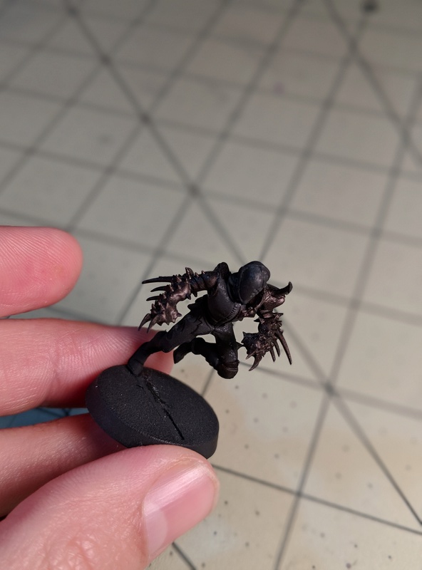 The edging is a Sotek Green/ White Scar mix with a lighter highlight on each pass. The accents are done in Runelord Brass and Genestealer Purple. There is also an average attempt at some freehand painting of the kabal's insignia visible on the Raider. The tone of the Kabal is (without getting into too much fluff of the army - perhaps i'll post that elsewhere should there be interest for it) regal and/or noble...remnants of the houses and bloodlines long since forgotten from the fall. The scheme is intended to look tarnished or tainted, as those who reside in Commorragh are themselves, tarnished and tainted from their once noble and innocent origins. That nobility, long faded, is hopefully reflected in the meticulous maintenance and ornate designs of the Kabal's colors (I mean, we are kinda the OG's of vanity after-all, right?). *Disclaimer* These following models are painted a bit "heavy" - they were the first models I painted over 4 years ago. I have since seen discovered how using a wet pallet can vastly improved my edging subtlety and overall paint thickness. I hope evidence of this "improvement" will be obvious on future models! 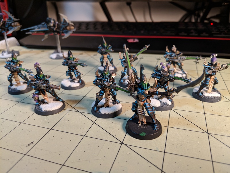 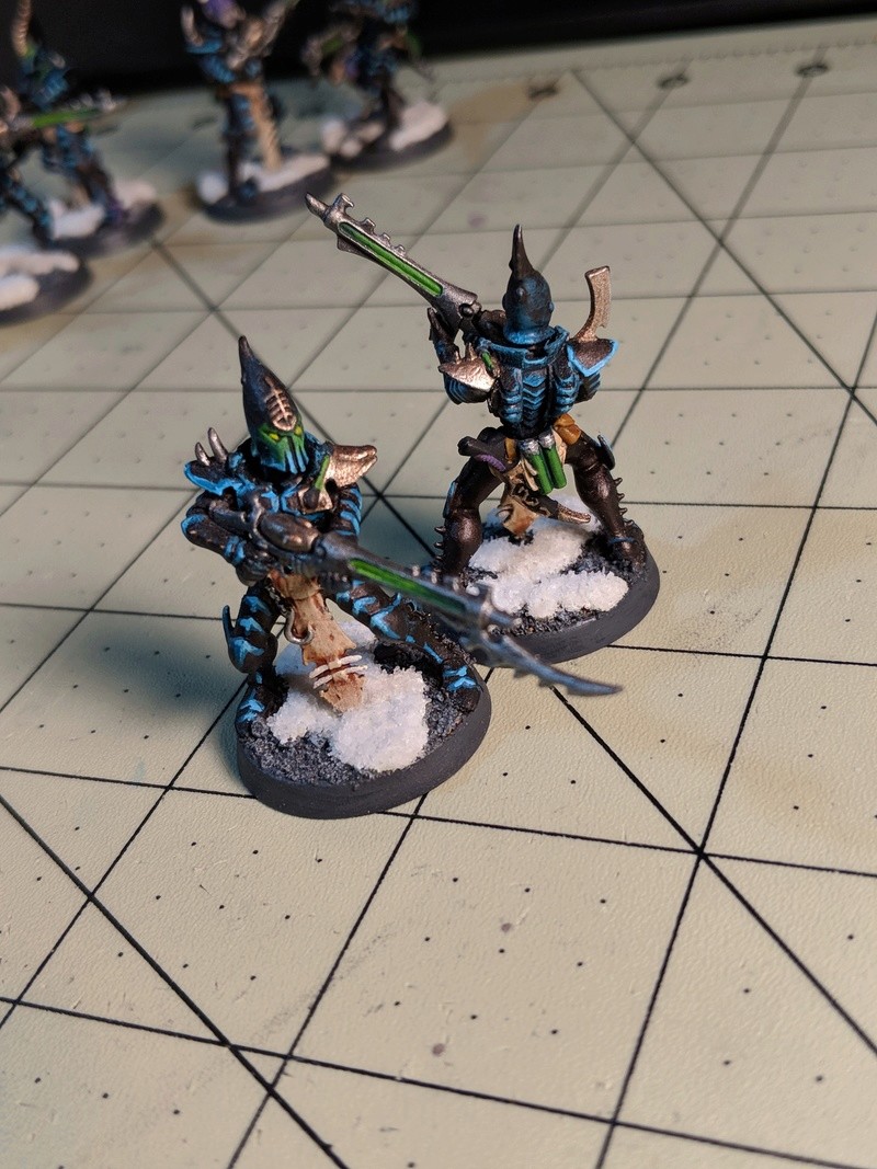 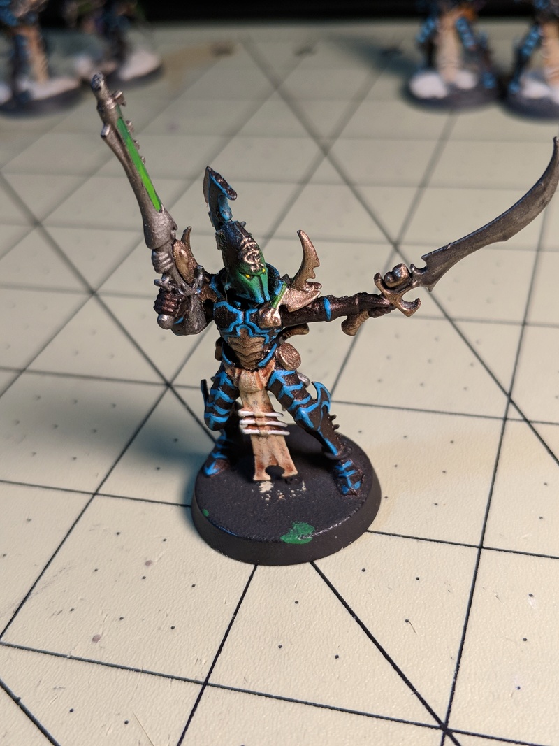  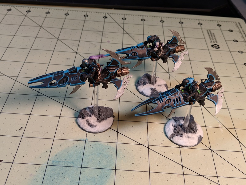 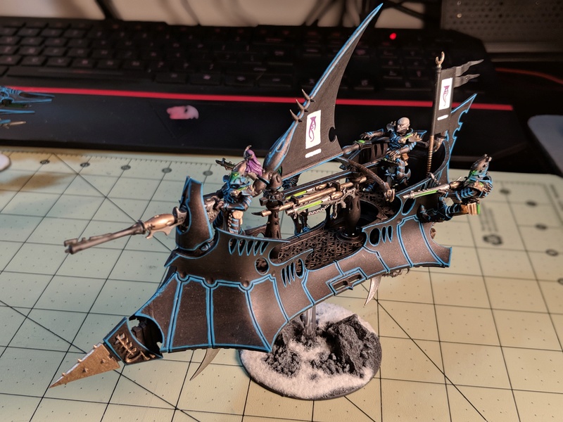 The following models consist of some light conversion work - as I am trying to add a little uniqueness to my army. The first couple of photo's are of some Trueborn conversions. Some modified shard carbines will act as "Blasters". Once painted appropriately I am hopeful that there will be a noticeable difference in these from the standard splinter rifle. One may also notice the absence of helmets...I figured the elite of Commorragh also possess overwhelming vanity and hubris and what better way to show that than shedding potential protection. Also, more Brass accents will be added to highlight their nobility and elevated social status amongst the inhabitants of The Dark City.  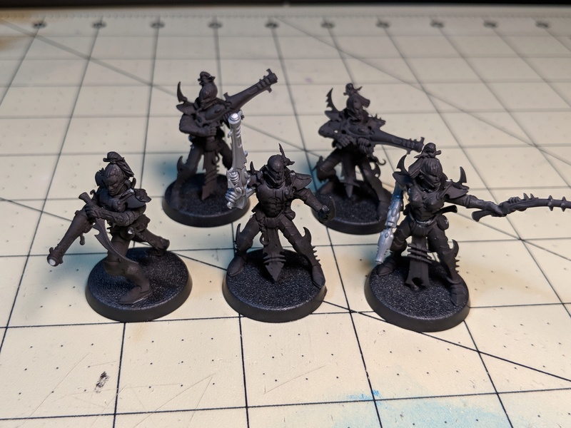 Finally, are two Archon models. Without getting too fluffy - I've always loved the idea of the elite or noble getting roped up in the "gangs" of Commorragh, so I thought "why couldn't an Archon rise to power from the social status of Scourge?" With that said, two brothers (to be named in a later fluff piece) have indeed risen from the ranks of hired guns to become prominent figures in the high spires of Commorragh. The helms and weapons obviously stand out at current, but later, the addition of the signature scourge wings will be added. The Archons have also been re-based on 32mm stands to better separate them from other units. 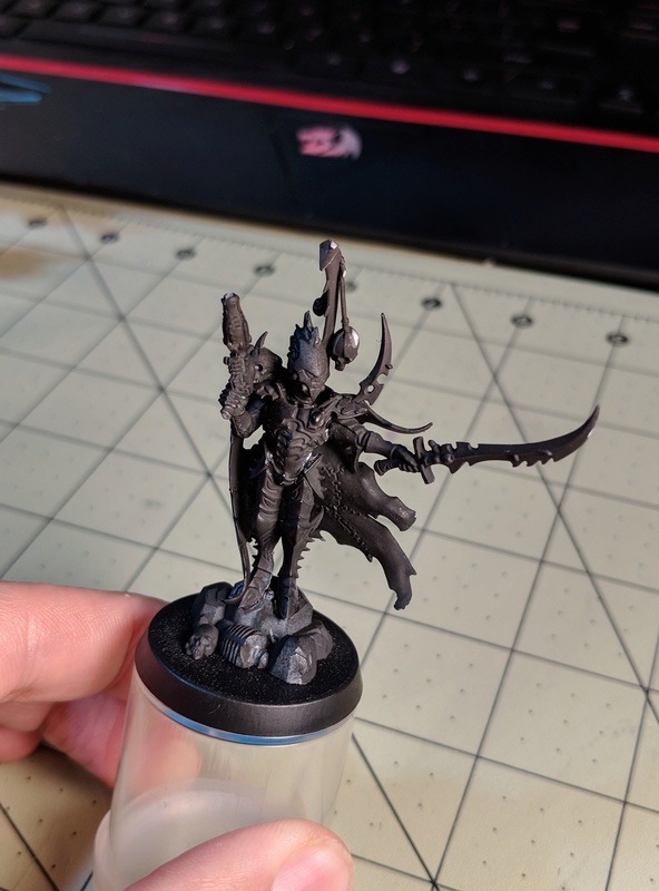  So that's it for now...Please feel free to comment and critique as much as you would like - as all feedback is welcomed and appreciated. We have some truly gifted painters/conversion artists in this community and I am honored to share the same venue of expression! (sorry if that last bit was a little "Emperor-y"...I'm new.)
_________________
Kabal of the Sinister Void - A Project Log
Wych Cult of the Cynical Blade
Coven of the Second Awakening
Frozen Death World Gaming Board - A Project Log
"Words have no power to impress the mind without the exquisite horror of their reality."
| |
|  | | spellcheck2001
Le Maitre Macabre

Posts : 1325
Join date : 2013-03-28
Location : La La Land
| | Subject: Re: Kabal of the Sinister Void Thu Jan 25 2018, 22:39 | |
| Hello and welcome  I like the dark look of the armour you are trialling, it definitely works. With a few highlights on it I think it will look great. It is always good to look back and see how you have progressed as a painter. I came on leaps and bounds when I discovered a wet palette. Get yourself a decent paintbrush (Windsor and newton series 7 are excellent) and brush soap, and you won’t ever look back. Looking forward to seeing more of your stuff here SC _________________  My DE project log  :- Harlequin Carnivale - La Danse Macabre  My Wargaming blog  :- Objective Secured | |
| | | | Sinister Intent
Slave
Posts : 20
Join date : 2014-06-19
Location : Saratoga Springs, New York
| | Subject: Re: Kabal of the Sinister Void Wed Feb 07 2018, 18:50 | |
| Thanks SC! It's great to get feedback and advice from experienced painters out there. I do have a question for you regarding the most efficient ways to achieve highlighting with my desired color pallet. - spellcheck2001 wrote:
I like the dark look of the armour you are trialling, it definitely works. With a few highlights on it I think it will look great.
SC When you say "highlights" are you speaking to the edging contrast on the armor (blue/teal) or shading of the actual Warplock bronze/black armor bitz? I've been apprehensive to try washes on the armor as it will likely dull the metallic finish but I do think there needs to be a bit of depth aside from the edging in teal. Would a lighter highlighting of warplock and black on the raised edges do the trick in your opinion? Thanks again!
_________________
Kabal of the Sinister Void - A Project Log
Wych Cult of the Cynical Blade
Coven of the Second Awakening
Frozen Death World Gaming Board - A Project Log
"Words have no power to impress the mind without the exquisite horror of their reality."
| |
| | | | RedRegicide
Wych

Posts : 686
Join date : 2016-05-20
| | Subject: Re: Kabal of the Sinister Void Thu Feb 08 2018, 02:01 | |
| I like your colour scheme! Very cool
_________________
“No. Stop. Don’t go in there. You’ll all be killed,’ Motley murmured sardonically”
| |
| | | | Sinister Intent
Slave
Posts : 20
Join date : 2014-06-19
Location : Saratoga Springs, New York
| | Subject: Re: Kabal of the Sinister Void Fri Feb 09 2018, 18:31 | |
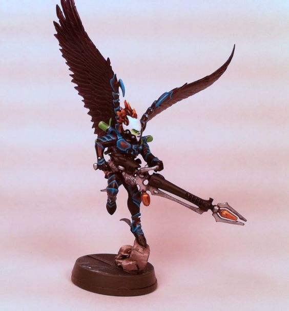
| Thanks, Regicide! A little bit of progress has transpired with my Kabal since my recent foray into terrain making...Since I have roughly 12 sets of Scourge wings to paint, I figured I would sort out my color scheme for the feathered wings. Since the motif of the army is dark metallic tones with teal edge highlights and purple and green accents - I figured a cohesive look amongst the Scourges would be in order. The first two pictures are of the front side of a wing with minimal contrast highlighting/dry brushing. The middle section of feathers is the same color as the outer section and has only received slightly less highlighting than the outer. 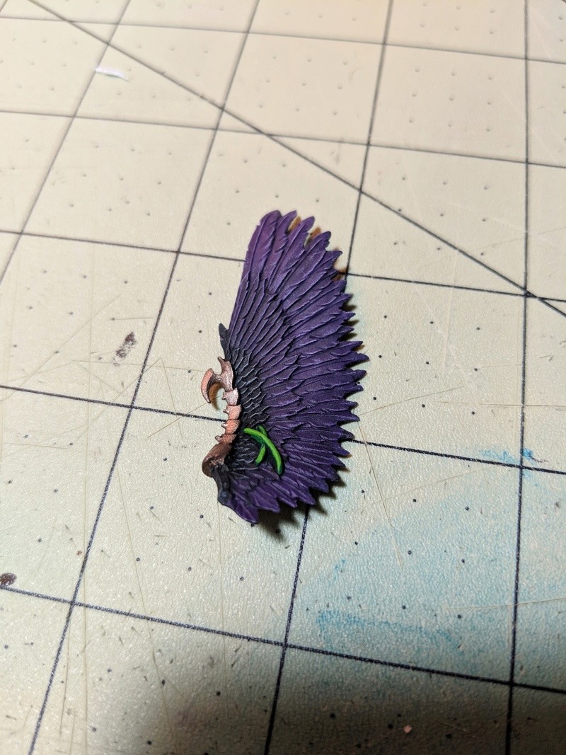 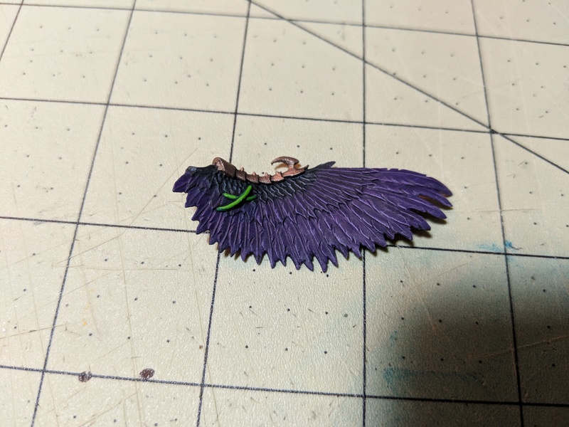 The next two photos are of the backside of the same wing. It was prepared with the same base colors but has received much more contrast via washes and shading. There is a much more gradient working of black to light purple from the inner feathers to the outer feathers. 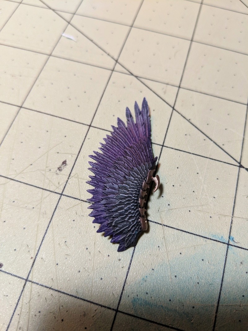 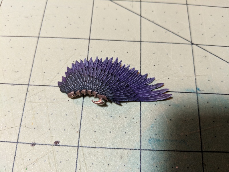 I am leaning towards the second technique, but would love any C & C on the matter! For bonus points, what is everyone's take on unified wing design/color or individualism expressed through different colors and shading patterns on each unique model? I'm torn, because while an army is a unified fighting force - each True Kin is a unique snowflake!!
_________________
Kabal of the Sinister Void - A Project Log
Wych Cult of the Cynical Blade
Coven of the Second Awakening
Frozen Death World Gaming Board - A Project Log
"Words have no power to impress the mind without the exquisite horror of their reality."
| |
| | | | yellabelly
Sybarite
Posts : 344
Join date : 2017-11-16
| | Subject: Re: Kabal of the Sinister Void Fri Feb 09 2018, 21:48 | |
| I'd cast my vote for the second paint job with the higher contrast. Once on the table, anything too subtle tends to blend into itself anyway. Look great though, the purple works really nicely.
Unified wing colours? I think I will be doing when I get round to painting my Scourges. Each set of wings will get the same colour palette but a different pattern/design to give them some difference.
_________________
Do you fight for the Dark Gods? The Drukhari gave birth to one of them. By partying.
| |
| | | | Sinister Intent
Slave
Posts : 20
Join date : 2014-06-19
Location : Saratoga Springs, New York
| | Subject: Re: Kabal of the Sinister Void Tue Feb 13 2018, 06:43 | |
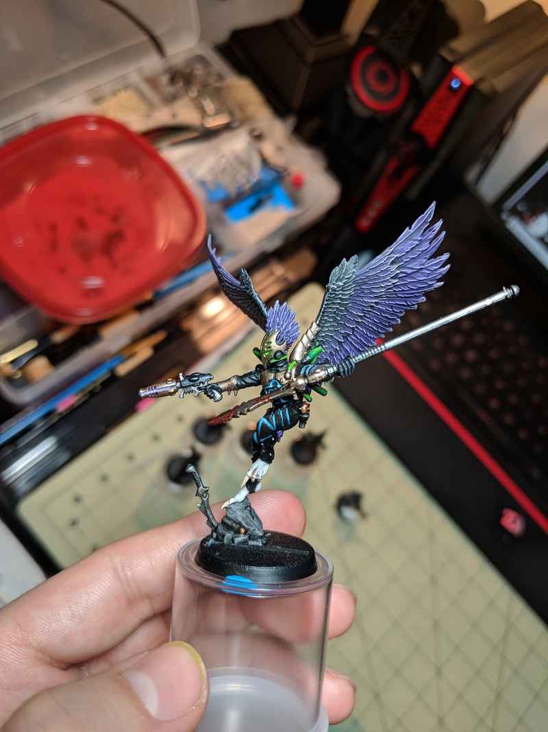
| Thanks for the feedback, Yella. I have indeed decided to go with a higher contrast to help bring out a bit more detail on the table top. I am fairly pleased with the results thus far. Attached are a few WIP shots of the wings before some finishing touches. Also, despite wanting a little variety in the color scheme/pattern I opted to go for a more uniformed look. After some thought, I figured a uniformed look would add to the cohesiveness and, quite honestly, I just really loved the current color pattern and didn't want to deviate  Anyways, thanks for the continuing advice and support, all. More to come soon. 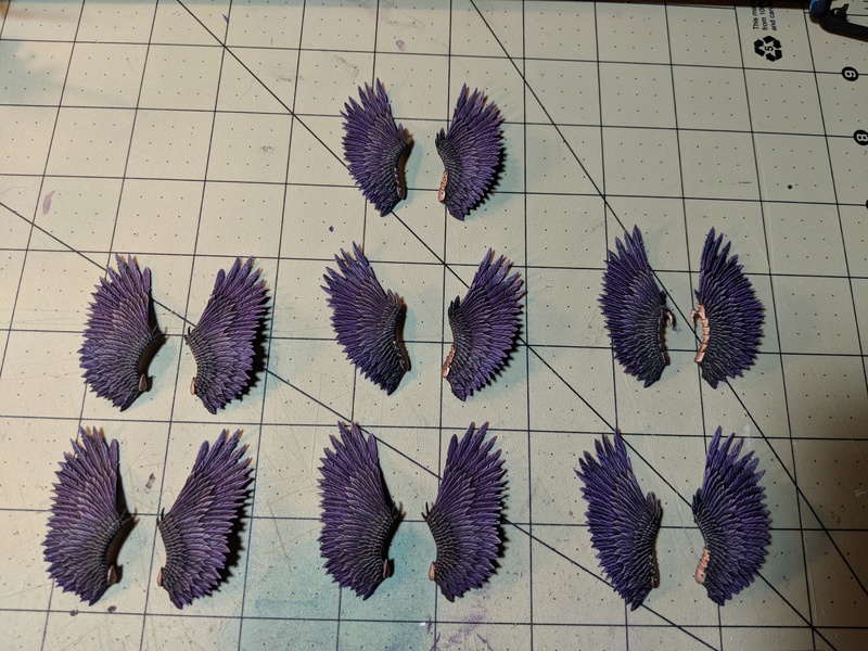 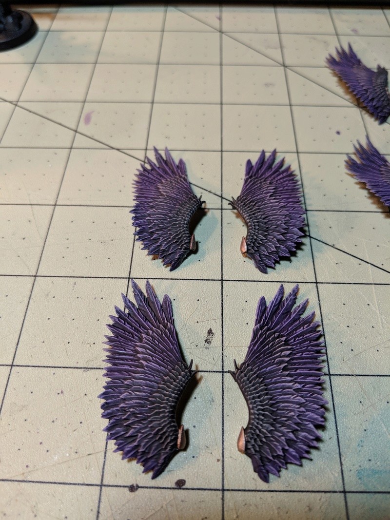 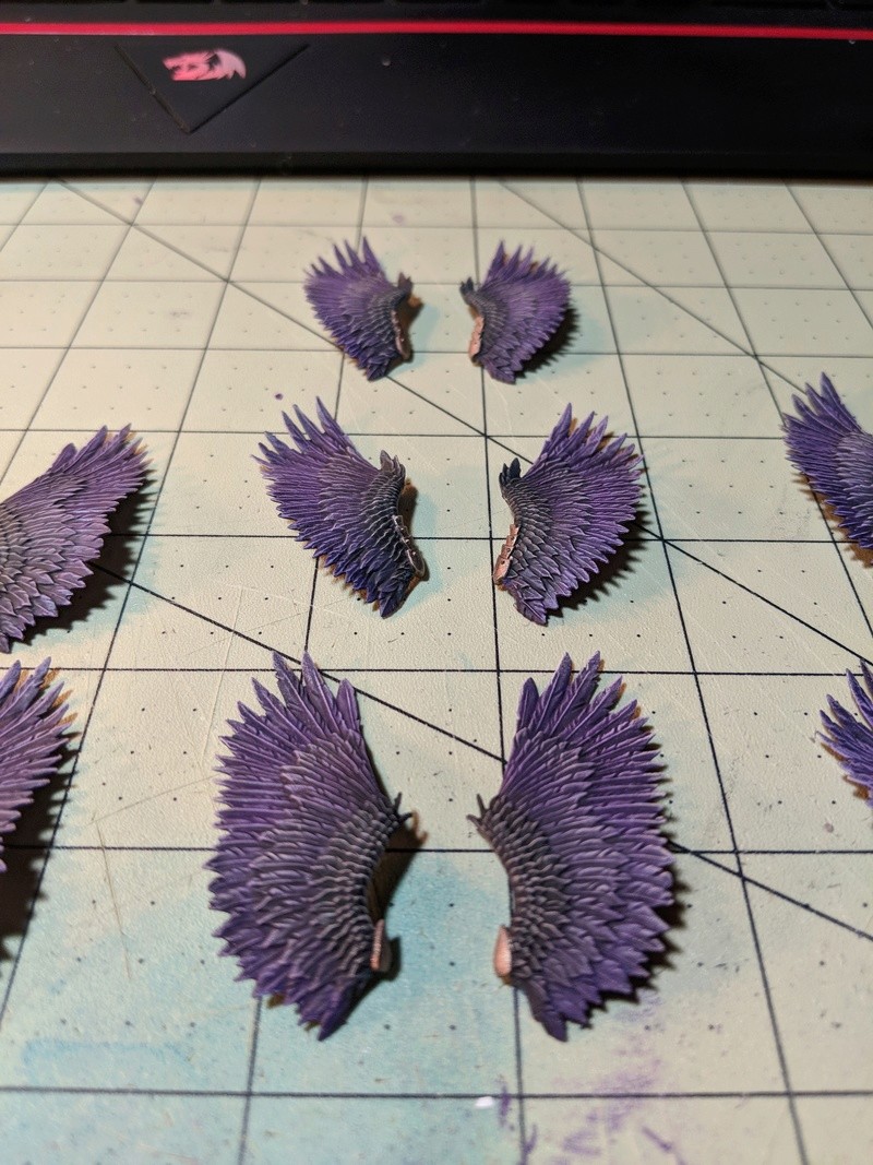
_________________
Kabal of the Sinister Void - A Project Log
Wych Cult of the Cynical Blade
Coven of the Second Awakening
Frozen Death World Gaming Board - A Project Log
"Words have no power to impress the mind without the exquisite horror of their reality."
| |
| | | | Sinister Intent
Slave
Posts : 20
Join date : 2014-06-19
Location : Saratoga Springs, New York
| | Subject: Re: Kabal of the Sinister Void Tue Mar 06 2018, 05:33 | |
|
_________________
Kabal of the Sinister Void - A Project Log
Wych Cult of the Cynical Blade
Coven of the Second Awakening
Frozen Death World Gaming Board - A Project Log
"Words have no power to impress the mind without the exquisite horror of their reality."
| |
| | | | Kantalla
Wych

Posts : 874
Join date : 2015-12-21
| | Subject: Re: Kabal of the Sinister Void Tue Mar 06 2018, 06:20 | |
| The feathers look really cool, but the edge highlights don't look right to me as the contrast to the black is just too much. Perhaps you could paint the black in more of a mid blue before using that bright highlight.
The green provides some interesting pop and like the metal just looks like it needs another highlight to be really complete. I would practice that through the rest of the squad and maybe come back to the test model if you feel you have made progress.
_________________
From a midnight sky, there is a searing flash, a boom, a brief moment of destruction, and then it is gone.
Kabal of Lightning Strikes - Project Log
Drukhari damage output analysis
| |
| | | | Calyptra
Wych
Posts : 802
Join date : 2013-03-25
Location : Boston
| | Subject: Re: Kabal of the Sinister Void Tue Mar 06 2018, 17:33 | |
| Nice work. There's clear growth/development from your Kabalites to this.
_________________
Dark Eldar plog: Drug-Crazed Space Elves
Stupid humans plog: Calyptra's Stupid Humans
Vampire Counts plog: Bat Country
| |
| | | | Sinister Intent
Slave
Posts : 20
Join date : 2014-06-19
Location : Saratoga Springs, New York
| | Subject: Re: Kabal of the Sinister Void Wed Mar 07 2018, 20:41 | |
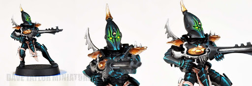
| Thanks for the feedback, everyone. @Kantalla, I think you have hit on some interesting points in your analysis. While, admittedly, the high contrast look of the armor edging might not be everyone's cup of tea, it is the desired look I am trying to achieve. If anything, perhaps a more subtle blending of the blue into the armor color could soften the harsh transition you're referring too. (its also worth noting that the armor is actually a blend of black and warplock bronze - perhaps the mixture needs more "bronze" to lighten it up a little?) I certainly respect and appreciate your comment's but think we can probably leave it at "creative differences" with regards to the edge highlights  However, I have been thinking that there might be too much going on with respect to the color pallet of the model. While the green is normally a "pop" or color here and there, the color scheme seems a bit all over the place when you add the purple wings, gold armor and blue edging highlights. I'm thinking of re-painting the vials on the scourge a black with grey highlights and then applying a gloss varnish, such as 'ardcoat, to give them a "glassy" look. This will hopefully decrease the color diversity of the model by lessening the amount of green throughout the mid to upper section of the model. Thoughts? @Calyptra - Thanks very much! I'm almost ashamed to have my first models, painted nearly 5 years ago, up as the first thing people see when they check out this log   But in all seriousness, thanks for the encouragement and constructive support everyone - Next up will be my first attempt at airbrushing some vehicles...buckle up! (pun intended...)
_________________
Kabal of the Sinister Void - A Project Log
Wych Cult of the Cynical Blade
Coven of the Second Awakening
Frozen Death World Gaming Board - A Project Log
"Words have no power to impress the mind without the exquisite horror of their reality."
| |
| | | | Kantalla
Wych
Posts : 874
Join date : 2015-12-21
| | Subject: Re: Kabal of the Sinister Void Thu Mar 08 2018, 08:37 | |
| In terms of the edge highlights I imagine the armour if you are looking at the stock colour scheme (Black Heart), the armour is actually green, but due to lighting and the plated nature of the armour, it mostly looks dark, with just the sharp edges catching the light.
I'm naturally assuming the same when I look at your model, which is why the bright blue doesn't quite work for me. If you had a mid blue for most of the armour and then that same bright blue, it would work for me. I like the colour just not the amount of contrast.
Alternatively, if you are intending the edges not as a result of the lighting on the model but that they have dark armour with bright edges then the way you have painted them makes sense.
I like the green though, it adds to the busy-ness on the model, but I would try a model with the dulled effect and see which you like most.
_________________
From a midnight sky, there is a searing flash, a boom, a brief moment of destruction, and then it is gone.
Kabal of Lightning Strikes - Project Log
Drukhari damage output analysis
| |
| | | | Sinister Intent
Slave
Posts : 20
Join date : 2014-06-19
Location : Saratoga Springs, New York
| | Subject: Re: Kabal of the Sinister Void Thu Mar 08 2018, 17:34 | |
|
_________________
Kabal of the Sinister Void - A Project Log
Wych Cult of the Cynical Blade
Coven of the Second Awakening
Frozen Death World Gaming Board - A Project Log
"Words have no power to impress the mind without the exquisite horror of their reality."
| |
| | | | feti guap
Hellion

Posts : 26
Join date : 2018-03-06
Location : Chicago
| | Subject: Re: Kabal of the Sinister Void Thu Mar 08 2018, 21:40 | |
| You're scourge wIngs look amazing. I used the technique myself to paint mine.... I'm using red not purple though.
The gradient from light to dark makes a huge difference in appearance. I am playing with going from lift on the inside to darker on the outside. Opposite of what you have going on.
_________________
Skrrr skr ima slide thru
| |
| | | | Calyptra
Wych
Posts : 802
Join date : 2013-03-25
Location : Boston
| | Subject: Re: Kabal of the Sinister Void Fri Mar 09 2018, 21:13 | |
| I have a probably unhealthy obsession with line highlighting, so I definitely like the effect you're going for. The difficulty with the technique (in my opinion) is the extreme gradient on the inward-facing edge of the line. If the line is too sharp, it will read as a colored trim on the edges of the armor, so it needs to be soft - at least on one side - so it can transition into the dark color of the plates.
...I hope those sentences make sense to people who aren't me.
My approach is to nest the lines, in order to get that transition. I paint a fat line on the edge, then a brighter, thinner line on top of it, then a very bright, very thin line on top of that. And then I dot highlight the pointy bits.
It's certainly possible that there are less labor-intensive approaches that would yield equivalent or better results. That's just how I do it. (You can follow the link in my sig to my project log to see what I'm talking about and make your own conclusions.)
The thing I would encourage you to do is be deeply suspicious of black paint. Out of pot blacks tend not to have, for lack of a better word, depth. They look flat - like paint and not shadow or void. They're great for mixing or undercoating or detail work, but they're not great (in my opinion) for actually painting things black. I think you get better results from either mixing directly across the color wheel (which is tricky because the physical properties of specific pigments become a factor there) or making an off-black by just mixing a very dark color (possibly the one you got by mixing directly across the color wheel) with black.
If you're so motivated, taking a bit of paper or card and mixing colors to see what happens is always a good idea. In this case, it will let you experiment with different ways of producing "black", and then compare them side by side.
_________________
Dark Eldar plog: Drug-Crazed Space Elves
Stupid humans plog: Calyptra's Stupid Humans
Vampire Counts plog: Bat Country
| |
| | | | Sinister Intent
Slave
Posts : 20
Join date : 2014-06-19
Location : Saratoga Springs, New York
| | Subject: Re: Kabal of the Sinister Void Fri Mar 09 2018, 21:49 | |
| Thanks, feti guap! The wings were a labor of love but I think the results were totally worth it. I'd love to see some pictures of your work. I, myself, nearly went with a red color scheme so I'd be very interested to see how yours turned out. If I add to my current "flock" of scourge models I will likely work from light to dark as you are doing to establish a little uniqueness while still maintaining army wide cohesiveness. @Calyptra, your explanation and view point make total sense. I have been working with some lighter variations of my base color of armor so to make it look less black and give a greater feeling of depth. I wanted to avoid the lack of depth and detail you are referring too and I hope that a slight tweek to my bronze/black ratio will result in just that. Later tonight I'll post some photos of a couple vehicles I'm trying the scheme on. Hopefully the result is a richer contrast that works with the highlights, rather than against them while all the while providing depth. I'm actually very familiar with your project log and have found it very inspirational. Your work with Coven units, in particular, is astounding and demonstrates some phenomenal competencies in techniques and talent that I hope to one day be able to emulate! I continue to be appreciative of the on going support and suggestions from everyone. Thanks to all!
_________________
Kabal of the Sinister Void - A Project Log
Wych Cult of the Cynical Blade
Coven of the Second Awakening
Frozen Death World Gaming Board - A Project Log
"Words have no power to impress the mind without the exquisite horror of their reality."
| |
| | | | feti guap
Hellion
Posts : 26
Join date : 2018-03-06
Location : Chicago
| | Subject: Re: Kabal of the Sinister Void Sat Mar 10 2018, 01:06 | |
| Project log coming SOON Soon soon....
_________________
Skrrr skr ima slide thru
| |
| | | | Sinister Intent
Slave
Posts : 20
Join date : 2014-06-19
Location : Saratoga Springs, New York
| | Subject: Re: Kabal of the Sinister Void Tue Jun 05 2018, 00:53 | |
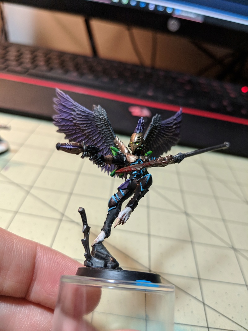
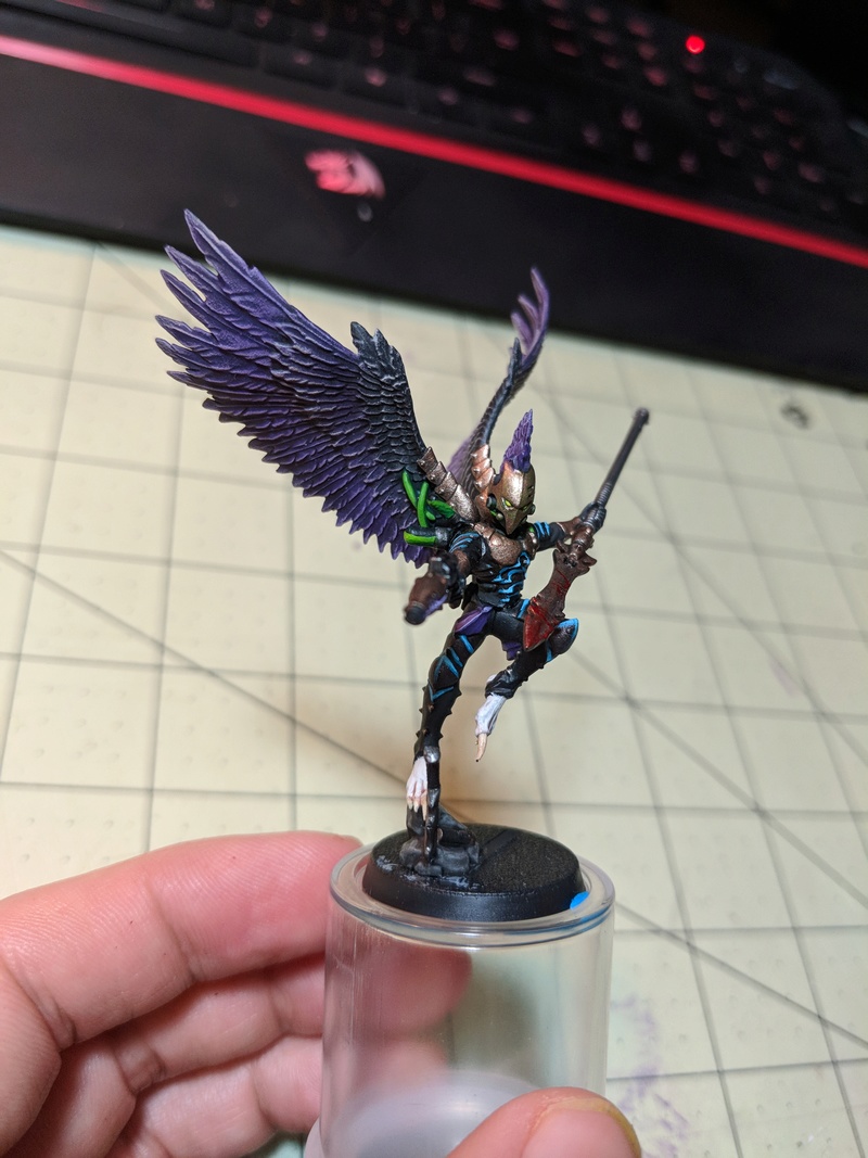
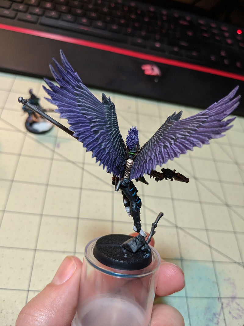
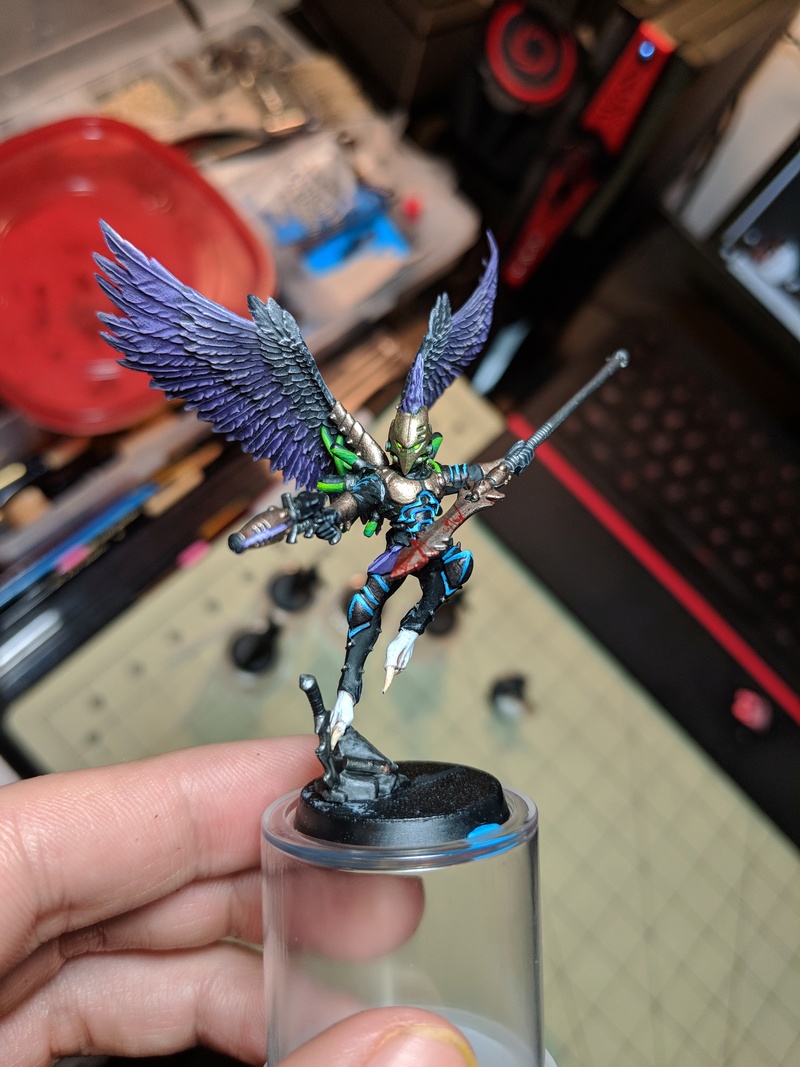
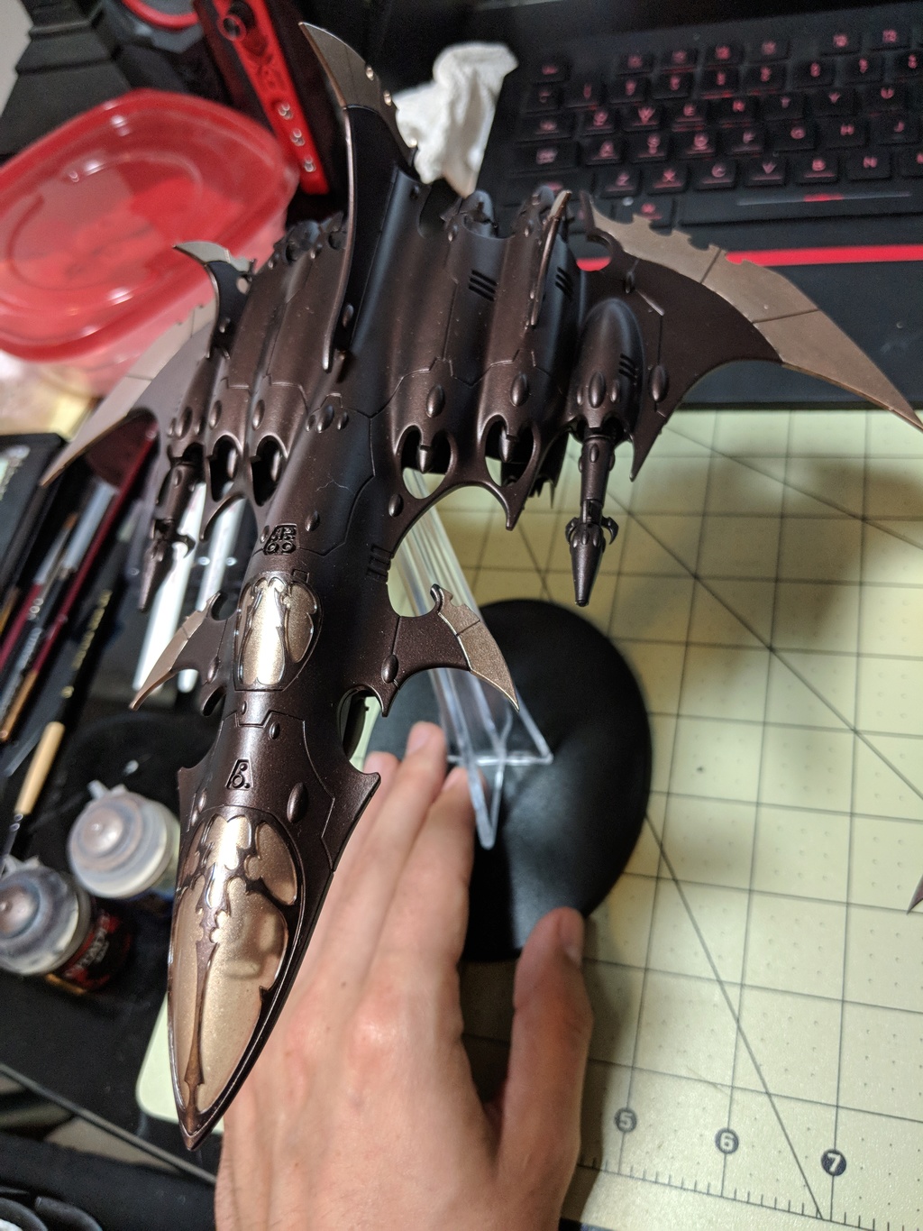
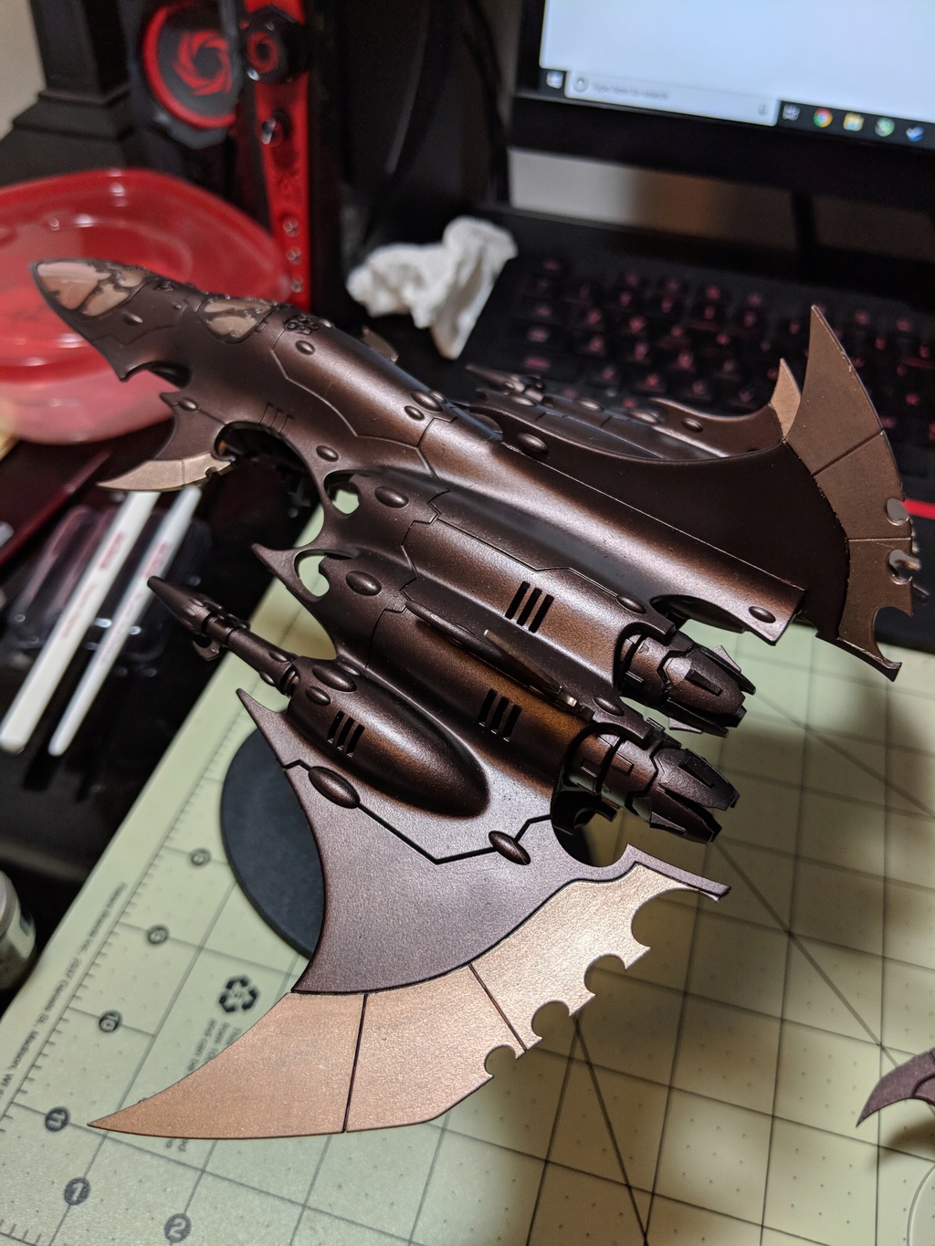
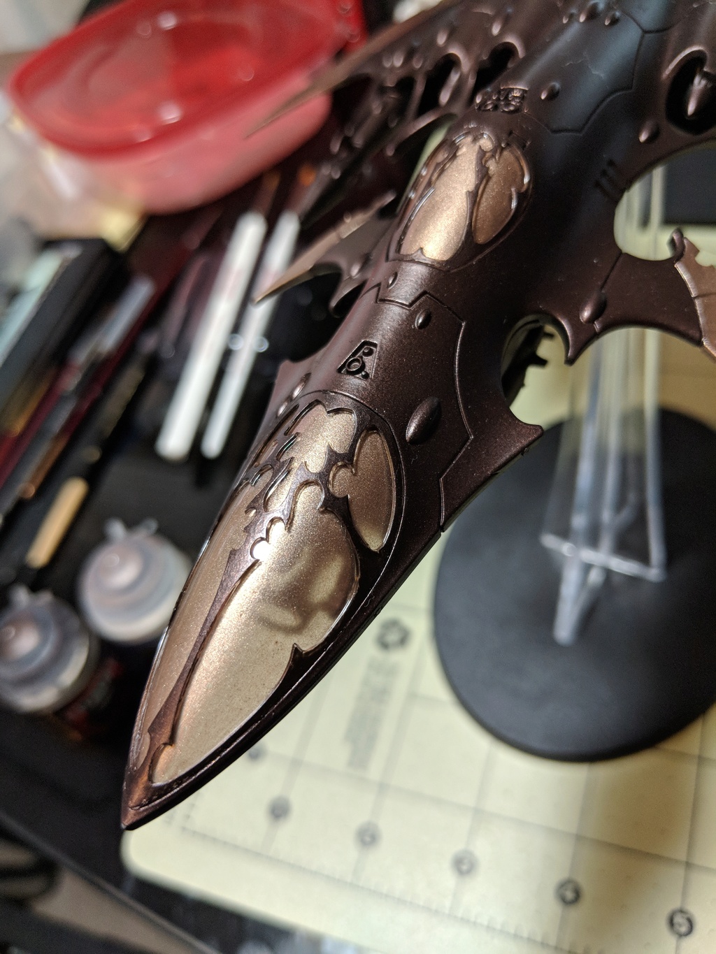
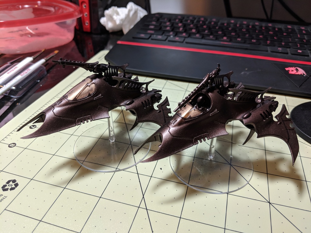
| Well, it's been an embarrassingly long time since my last update here but I suppose getting married and buying a house will slow the 'ole hobby progression a bit! The silver lining is I will finally be getting my own hobby "closest" once I move into the new house - so you can all be assured that progression pics of that space will pop up over the next couple of months. I'd love to pick the brains of some of you who have a designated space when designing my own. In any regard, I have made SOME progress since my last post - albeit minor. For starters, I have (nearly) finished my first squad of scourges. I'm pleased with a number of elements with these guys but several things continue to be a learning process (working with Runelord brass and not getting a "grainy" look under close examination/photography remains a bane of mine). I ended up going with a black vial, finished with 'ard coat and I'm very pleased with the result. I think more green against the purple wings was a bit too busy in my test model - but i intend to try the green "fluid filled vial" look on my next squad that will all have black "bat-wings". Basing is nearly done, but I figured for the sake of an actual update, i'd include their progress so far. Pics below. 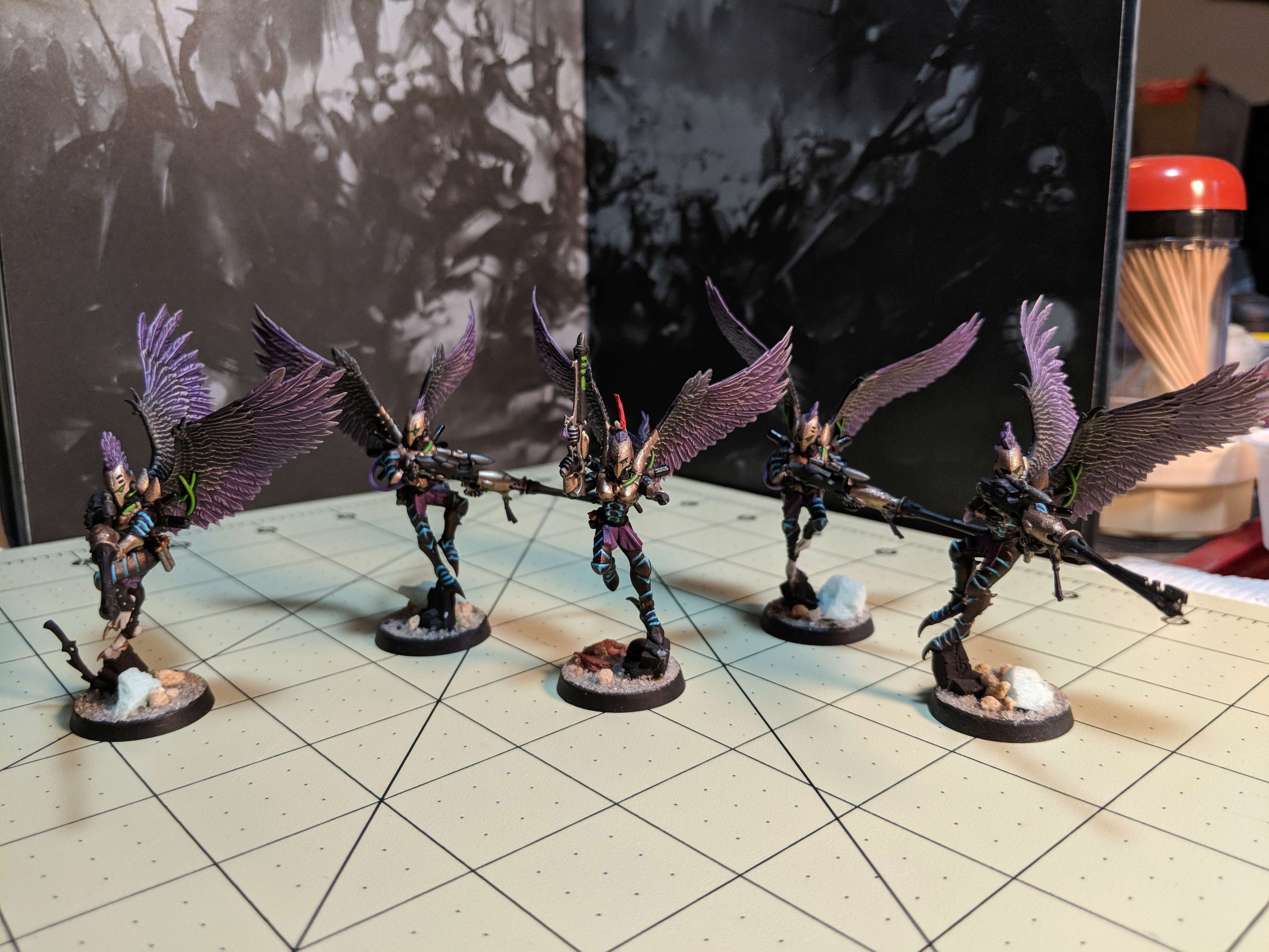 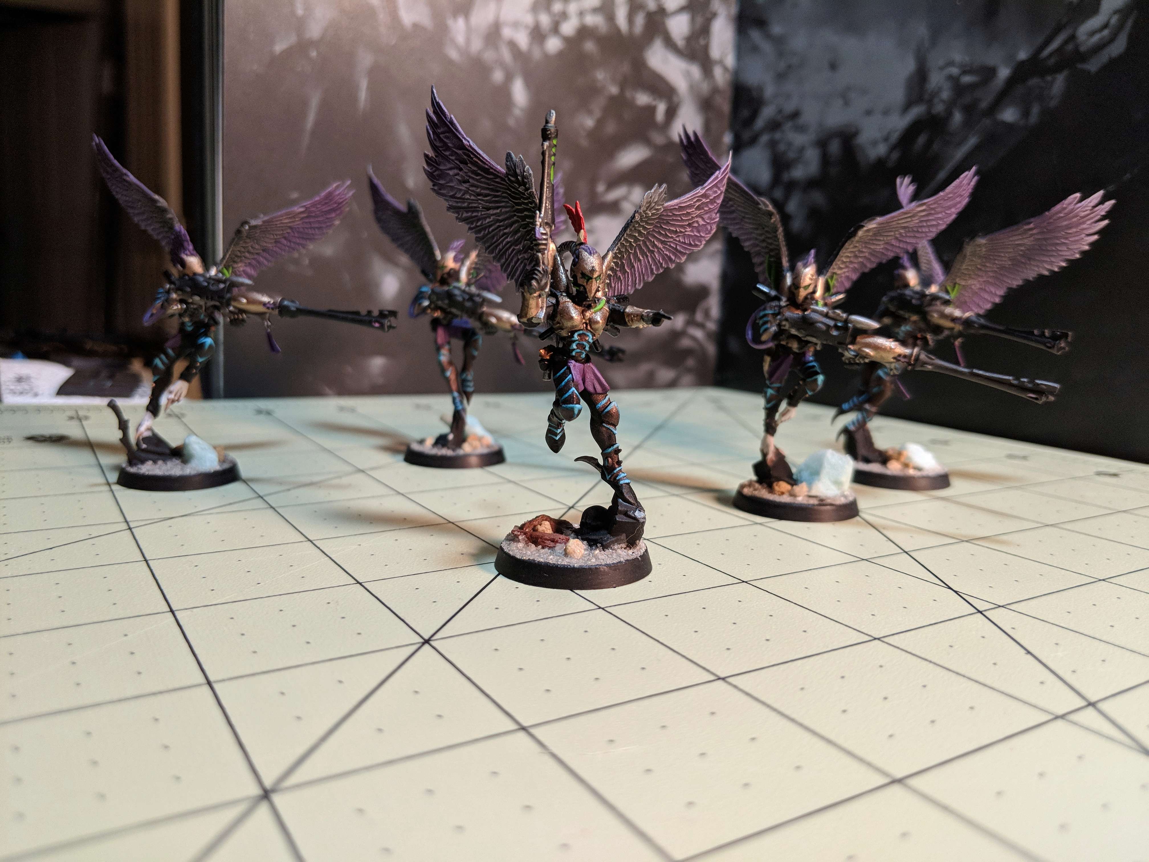 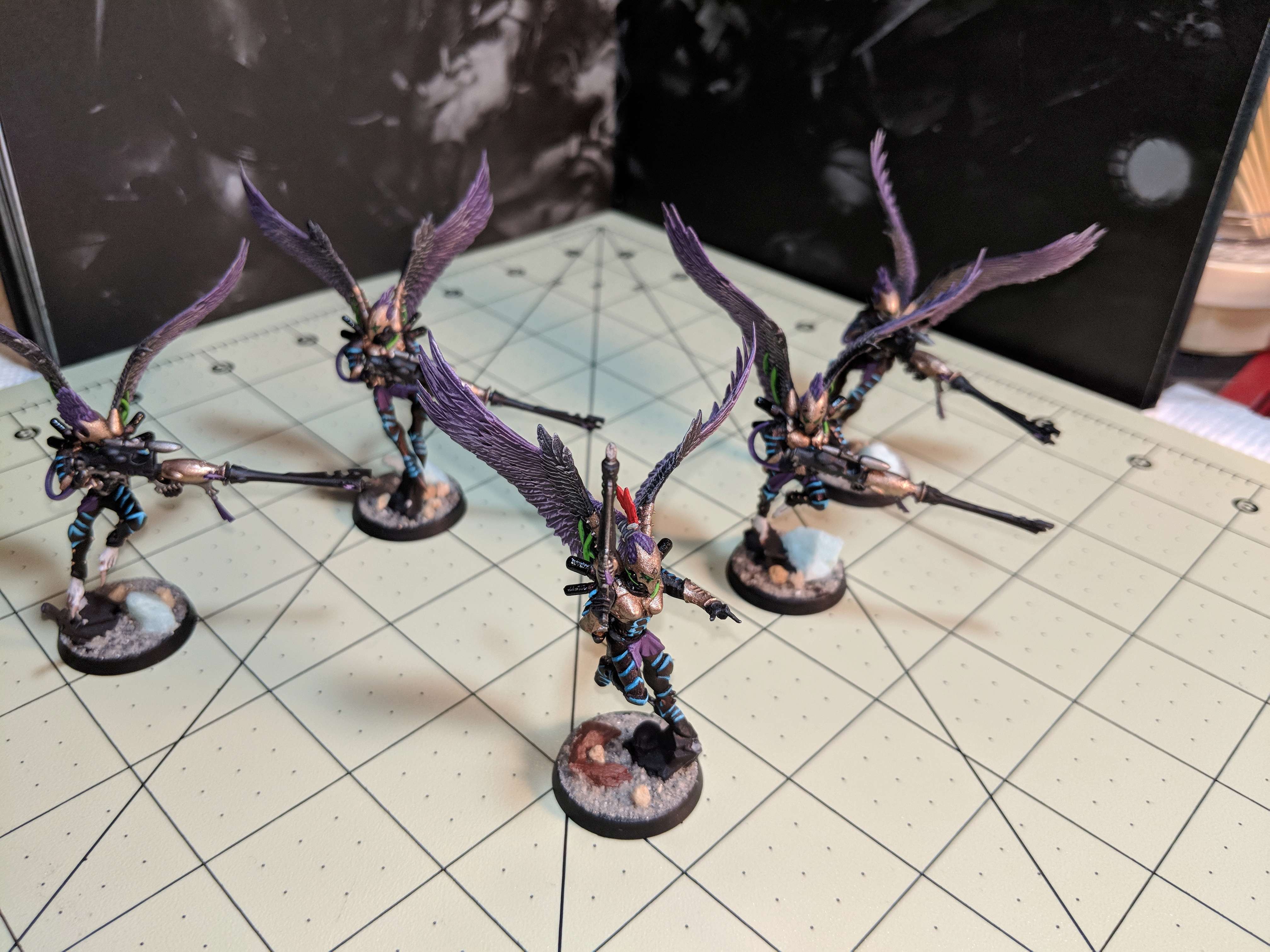   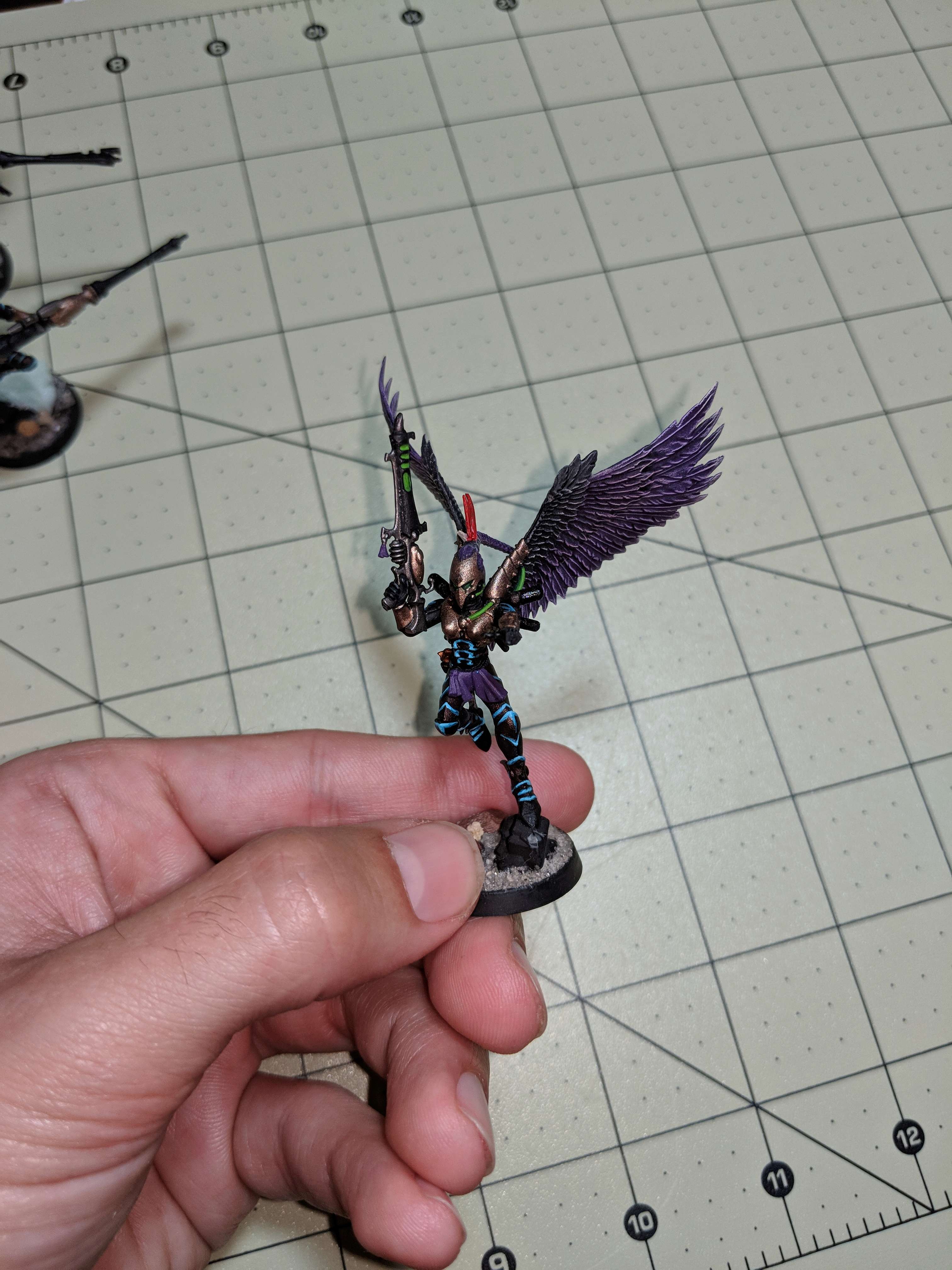 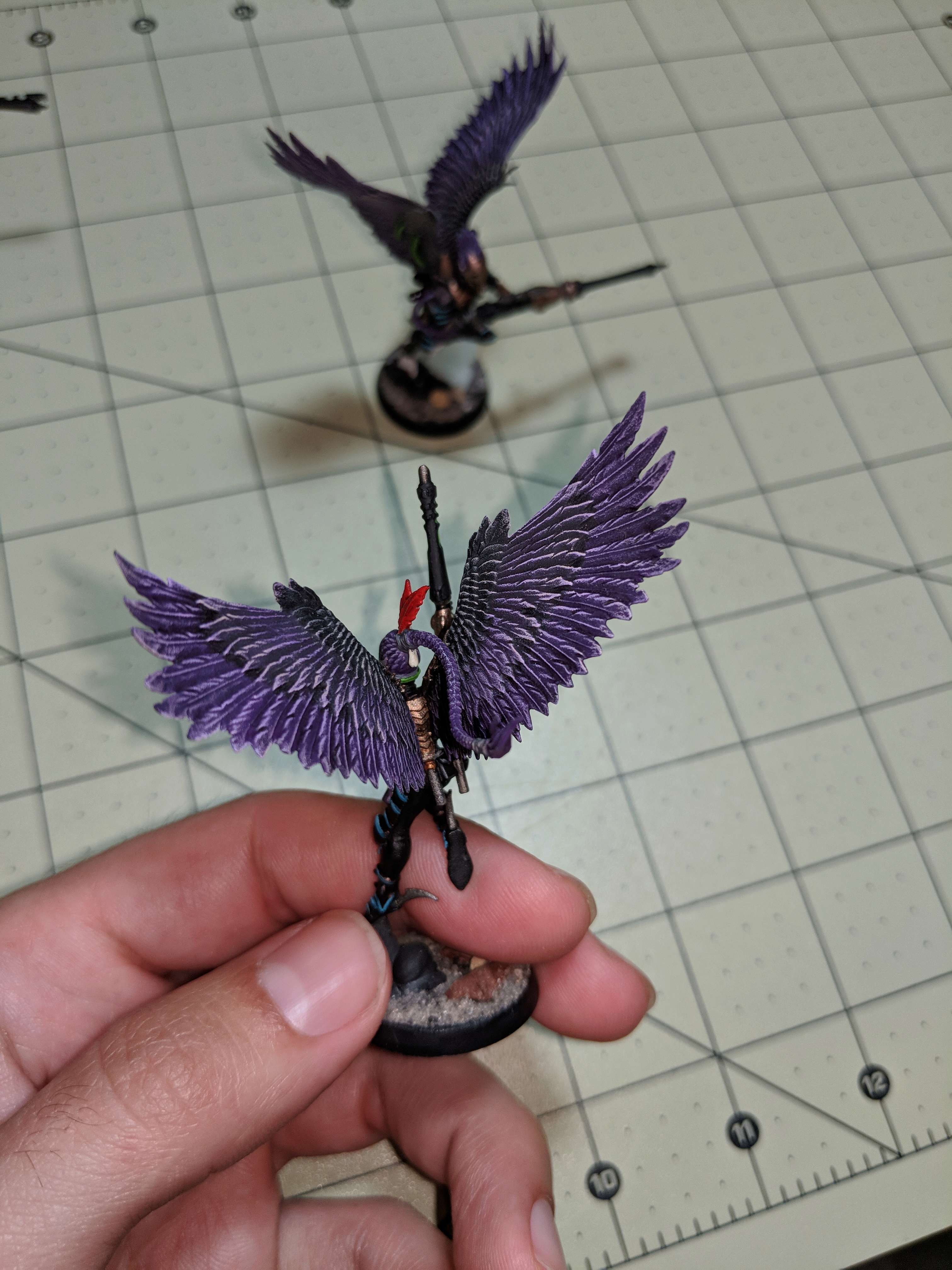 Also, as promised, i've been dabbling in some paint mixtures that will serve as my base armor color and vehicle color. This has resulted in some Beautiful Mind-esque notes and equations but I've really settled into the scheme below. In its simplest form, its Abaddon Black and Warplock Bronze with a whole host of other mediums in order to pump it through an airbrush and still maintain a level of reflective sheen without appearing gold. I've included a few black basecoated vehicles (Razorwing & Raider) for comparison in the pictures below. Anyways, hope you guys enjoy the the progress so far. I would make some promises as to whats up next but at my current life stage with everything going on - who knows! Thanks again for looking , everyone. C&C always welcomed. 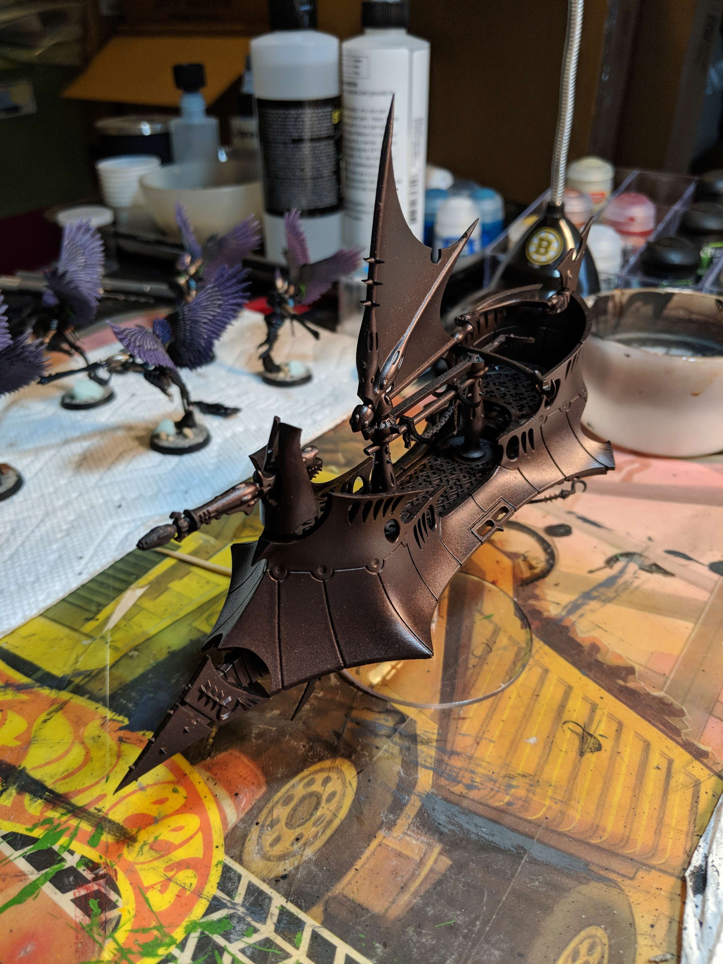 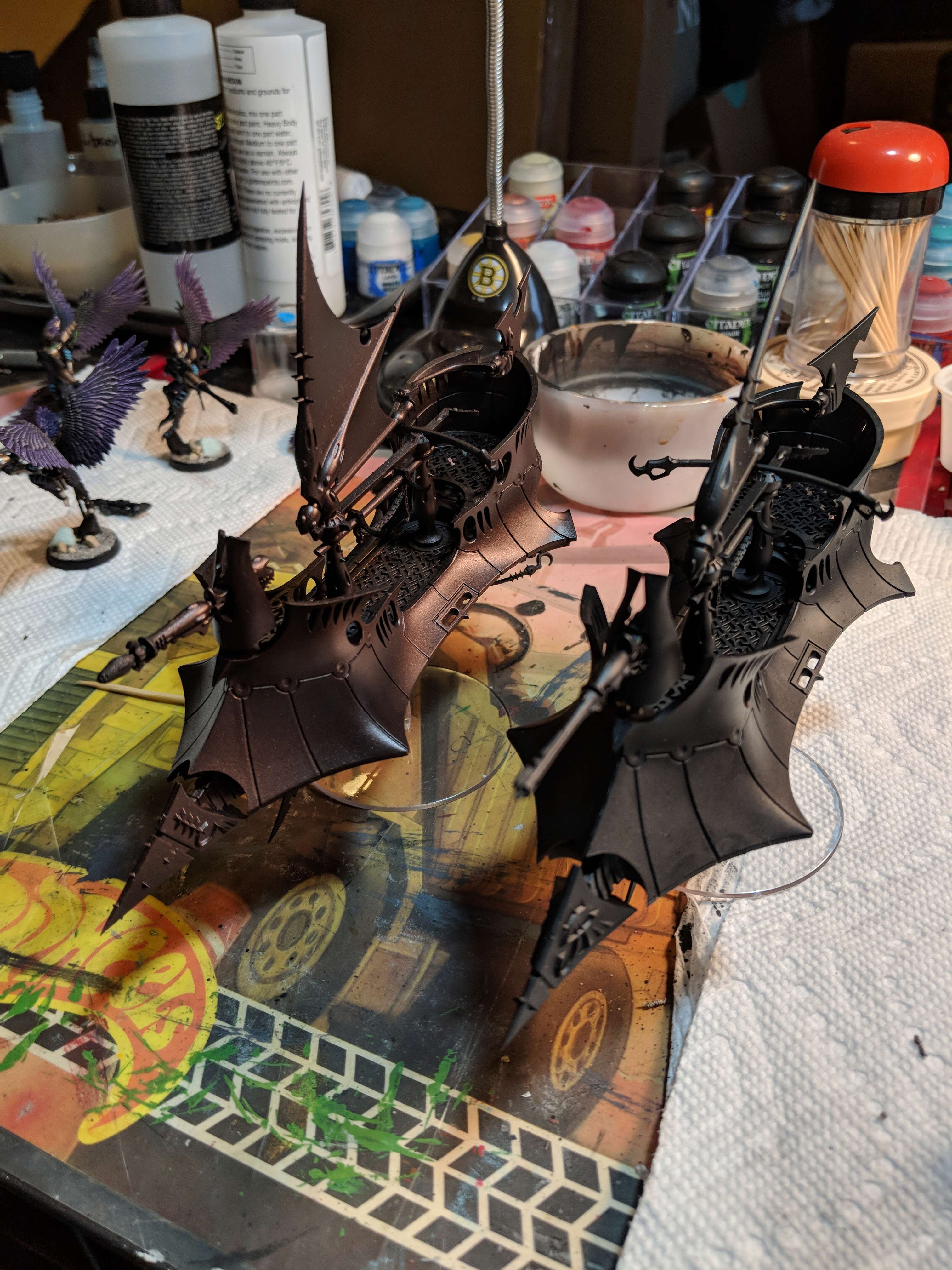  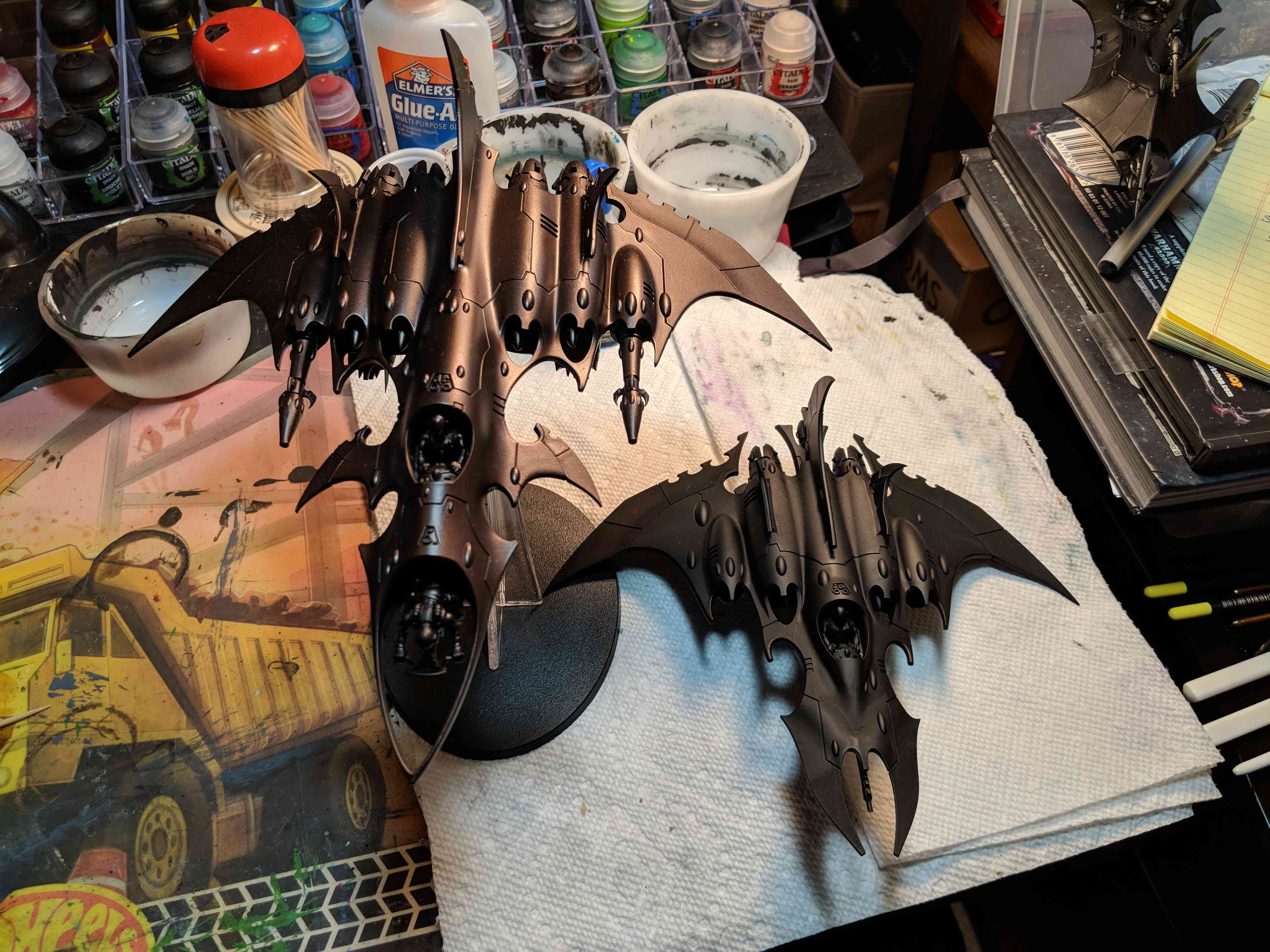 
_________________
Kabal of the Sinister Void - A Project Log
Wych Cult of the Cynical Blade
Coven of the Second Awakening
Frozen Death World Gaming Board - A Project Log
"Words have no power to impress the mind without the exquisite horror of their reality."
| |
| | | | Sinister Intent
Slave
Posts : 20
Join date : 2014-06-19
Location : Saratoga Springs, New York
| | Subject: Re: Kabal of the Sinister Void Sun Jun 17 2018, 20:27 | |
|
_________________
Kabal of the Sinister Void - A Project Log
Wych Cult of the Cynical Blade
Coven of the Second Awakening
Frozen Death World Gaming Board - A Project Log
"Words have no power to impress the mind without the exquisite horror of their reality."
| |
| | | | clively
Sybarite
Posts : 297
Join date : 2013-03-19
| | Subject: Re: Kabal of the Sinister Void Thu Jun 28 2018, 18:49 | |
| Those are looking fantastic. Also, after seeing yours, I am so going to have to repaint the wings of my scourges.
_________________
Kabal of the Green Hair
| |
| | | | Sponsored content
| | Subject: Re: Kabal of the Sinister Void | |
| |
| | | | | | Kabal of the Sinister Void | |
|
Similar topics |  |
|
| | Permissions in this forum: | You cannot reply to topics in this forum
| |
| |
| |
|