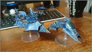
If I were to suggest 1 thing to improve these models, it would be to tone down most of the highlights. What I'd probably do, particularly with the raider, is to do the vertical highlights on the armour panels in a slightly darker colour.
What this will do is focus the eye on the other highlights (ie, the ones around the base and top of the armour panels) emphasising the long, thin sleek nature of the raider. I think at the moment the contrast between the main blue and the highlight, combined with the fact that every edge is highlighted to that extreme makes the model too 'busy' for my taste. That's not to say others will agree, but I think extreme highlights work best when they're limited to specific areas of the model.
_________________
Tan? You're joking, I'm a gamer, you're lucky I'm wearing deodorant!
My Blog - The Burning Eye Blog (check it out - comments always welcome)
My Project Log - Visions of the Burning Eye
My Gaming Log - Chronicles of the Burning Eye
My Club - MAD Wargaming
My Fluff - Kabal of the Burning Eye, Cult of the Shadowed Blade and Coven of Distorted Perfection


 [/img]